Carolinne Altrum—Corporate Interior Designer & Scenography
Carolinne Altrum is an interior designer based in Toronto, Canada, focused exclusively on corporate interiors and scenography — offices, coworkings, corporate headquarters, events and exhibitions. For the past two years, she's taken on independent projects on the side, while working full-time in the industry.
→ INDUSTRY:
INTERIOR DESIGN
→ YEAR & LOCATION:
2025, TORONTO- CANADA
→ SERVICES:
BRANDING KIT & CUSTOMISED WEB DESIGN
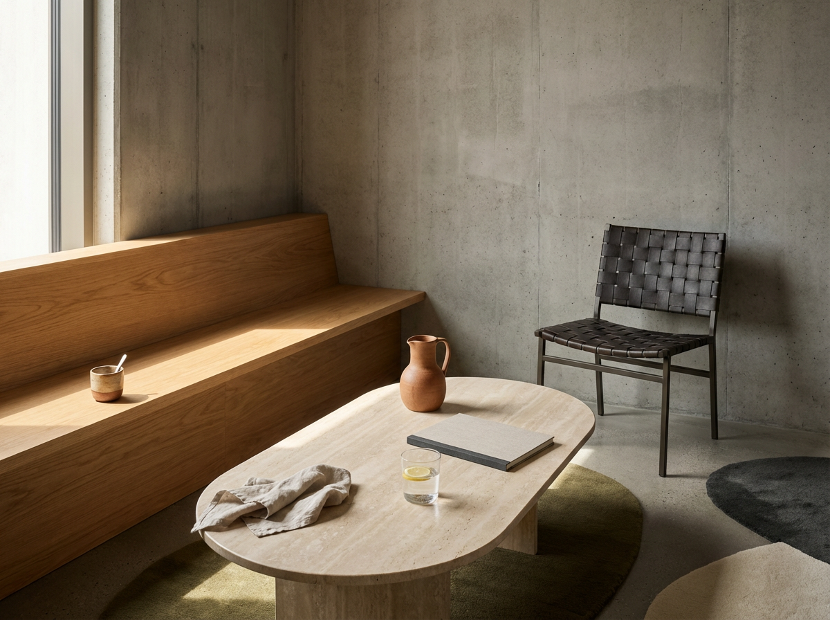
Carolinne Altrum—Corporate Interior Designer & Scenography
Bringing character and purpose to corporate spaces and experiences.
Project tasks: Brand Creation and one-page Squarespace website
Brand Creation & website development: María Fernanda Ayala, SAADLI® — Casa Creativa
Copywriting: Sandra Voltinaer
Creative & Strategic Direction: María Fernanda Ayala
Client location: Toronto, Canada, North America
▪THE CLIENT
Finding ground where the market wasn't looking
While studying Interior Design, Carolinne read an article written by her brother, pointing to a residential interior design market in Canada that was already saturated. That was enough to make her look elsewhere.
During her internship, she volunteered to help design a corporate event. That's where she found her true calling: corporate interiors and scenography.
The internship turned into a permanent role, where she began building her career. Two years ago, she started taking on independent projects while still working for the company, building up capital, experience and a client base of her own along the way. She then decided it was time to leave her job and focus entirely on building her own brand.
* 01/ BRANDING KIT
Where two worlds coexist
When I found out how Carolinne goes about her work, I spotted a really interesting contrast. She reckons loads of people think style is the most important thing in interior design, but really it’s just the bit you can see.
Behind every finished office or space, there’s proper technical planning. Accuracy is everything and there’s hardly any room for error.
But Caroline’s also big on the in-between stuff, the nuances, because for her there’s no one right answer.
That’s where two worlds meet: technical rigour and creative freedom. They might seem like opposites, but they actually balance each other out.

Off the back of that contrast, I started looking for words that really capture how Caroline works. Clarity came first, and two principles grew out of it: nuances and accuracy.
Together, they shaped a creative direction that ties in with the “Visionary” archetype: a brand that doesn’t just solve spaces, but explores what’s possible so each one reflects its client’s company culture.
A visible opportunity rooted in her heritage.
With the brand strategy in place, I started on the name. Caroline gave me plenty of creative freedom to explore different options. Since this was her personal brand, I wanted something that would set her apart in her industry, without inventing a word that described what she does.
Her first names were too traditional and common to work with, but her surname wasn’t. That’s how I landed on ALTRUM, her first surname. It’s got real character and strength, and it’s easy to say. But its value went beyond the sound, because it also carried a personal story. Caroline is the first woman in her family to break with the tradition of studying law, a choice that marks out her own path and starts a new chapter in her family’s story.
On top of that, there was a chance to stand out in Canada, where the surname is pretty uncommon. Instead of creating a name to define her profession, I could build a brand around something that already belonged to her: her roots.
ALTRUM lets her build an identity of her own and grow with it, without being tied to one style of interior design or one way of approaching her projects.
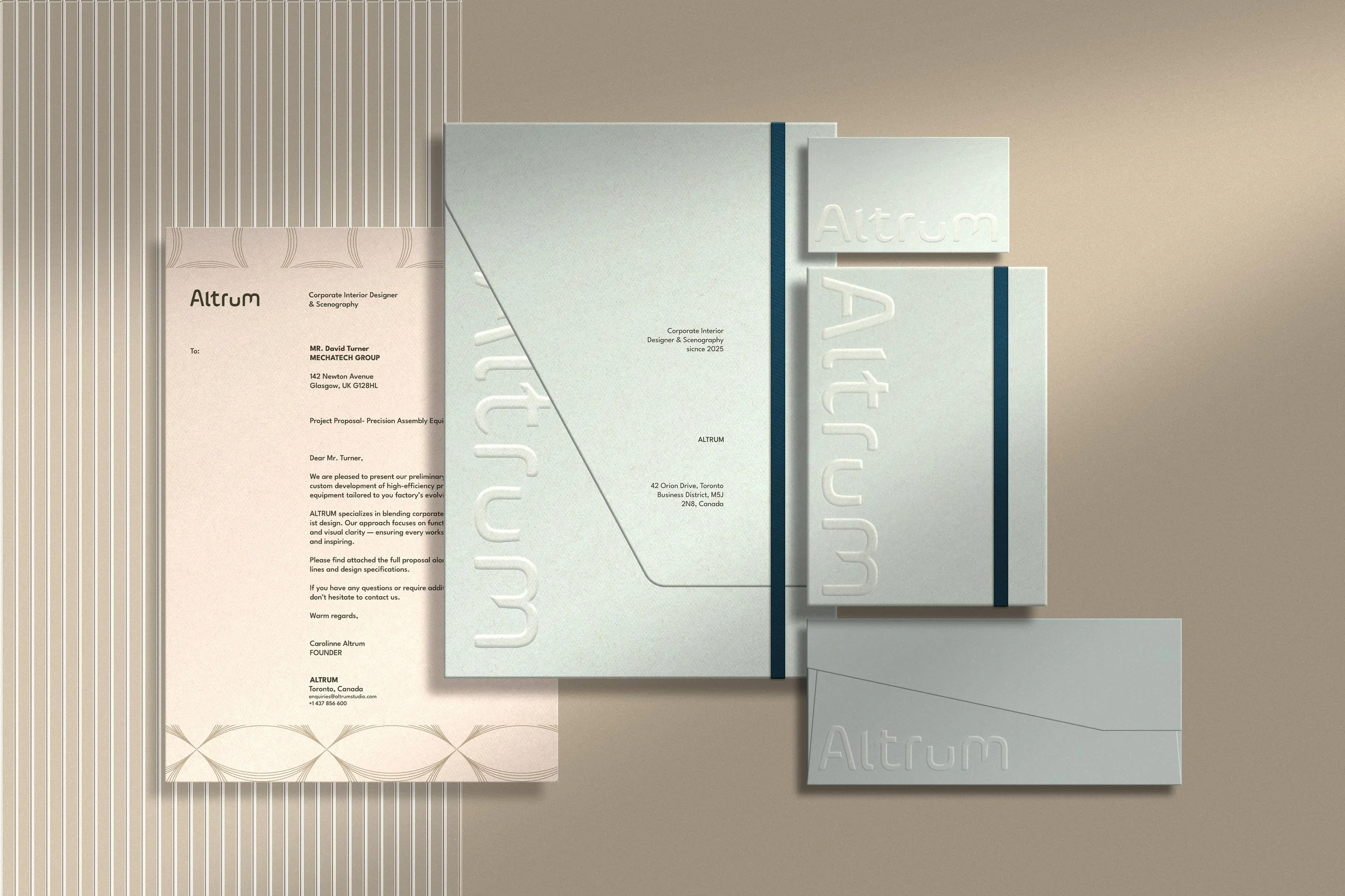
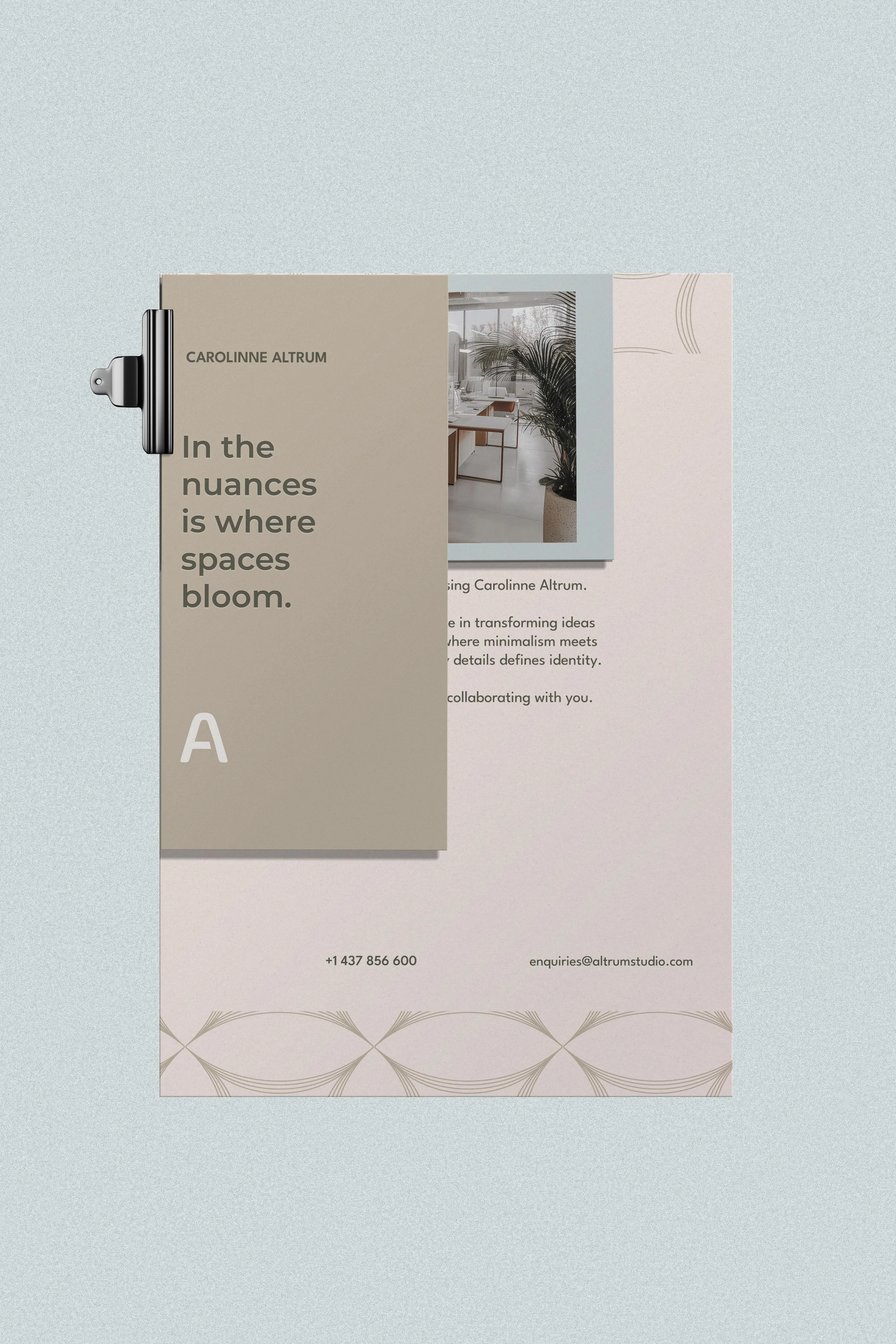
A voice that finds beauty in nuances
I was sure Carolinne’s way of working would come through most of all in the verbal identity. She sees interior design as a discipline that needs technical precision, but gets its personality from the details and nuances. That’s why every space she designs is unique.
Building on that idea, I worked with her on the tagline “In the nuances is where spaces bloom”. The line sums up a shared view of design: nuances aren’t an extra, they’re what gives each space its identity and character.
Typography being the connecting thread of both universes

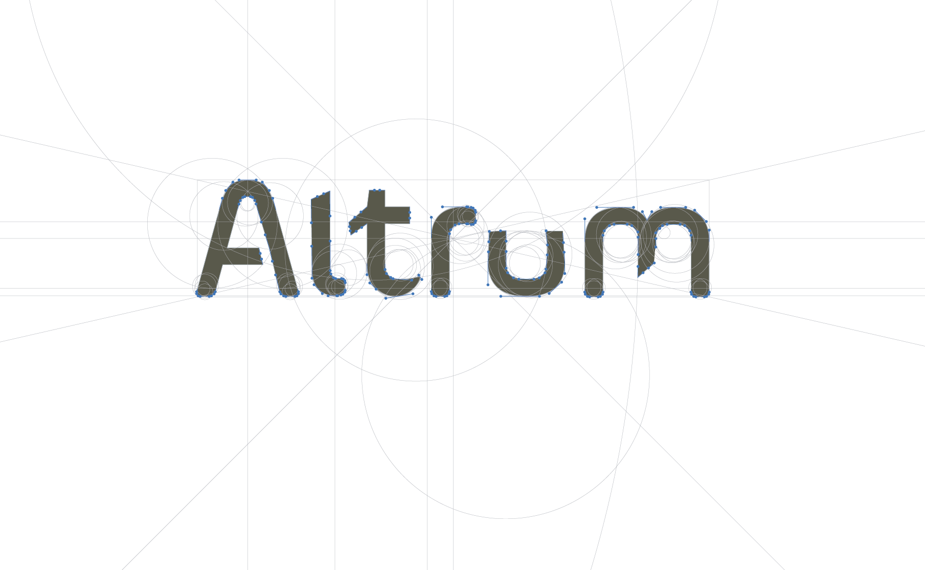
a. Next step after the sketch: some irregularities are visualized by winking at the nuances.
In an industry where delicate strokes are the norm, I went for a direction with more character, one that can express that duality without losing Carolinne’s creative sensibility.
That’s why I opted for a serif typeface that conveys structure, presence and balance.
While exploring how each letter could carry part of the concept, I added straight lines to the stems, plus ligatures and brackets, to express precision.
At the same time, I rounded off the terminals to bring in some openness, and kept a few small irregularities as a nod to the nuances.(a.)