→ Creative & Strategic services for Real Estate
Mónica Gundlach—Licensed Real Estate Saleperson
(i) Beyond the impossible
Serving the families the market overlooked
Monica Gundlach is a Bolivian living in New York. There she began her career as a secretary, finding her vocation in the real estate sector. With effort and dedication, he became a certified real estate agent.
On that journey, she noticed that many Latino families with good incomes were not getting the attention they deserved due to market biases and decided to focus her work there.
As a Latina, she understood her needs, but her personal brand needed to communicate not only that, but professionalism and trust.
He was also well aware that if his business had no structure, he could not grow. So we decided to work in the order that would allow him to have clarity and, at the same time, avoid losing ground in the market and build credibility.
Meraki’s mentorship[1]helped build the business model; branding later gave her a visible face that no one could see until then.
Realizing that credibility is built with judgment, it needed to be constantly made visible; it was there that the website was developed that would allow you to start with the minimum viable without compromising your investment.

[1] The first working session — the two of us, going through it point by point.
Where branding visualizes the idea linked to the business model.
From Sparse Signals to One Direction
The business model reflects the values and principles that Monica indicated from the outset. It is sustainable and allows it to grow in stages. The business lines created generate additional revenue from the sale, rental and purchase of real estate. The goal is not to create codependency, but to scale up.
The construction of his personal brand is honest, sincere and close. It seeks to break the barrier between its target audience and the usual stereotypes of the real estate sector. To develop verbal and sensory identity, we work with a language far from technical jargon. The point is to focus on the dream of having a house of your own; it's not a crazy idea, regardless of whether the customers are not natives. So we removed one of the buyer's many objections.
Language and paperwork are part of the bureaucracy, but they must not become obstacles. Branding addresses these barriers through body language and phrases that are part of verbal identity. Monica solves doubts and accompanies her clients before, during and after the process. In this way, it becomes the guide they need. This comes naturally to him because we highlight his personality, one of his greatest assets.


THE FOUNDATION OF EVERYTHING
With clear direction, I dedicated myself to looking for something that would unite Monica's adjectives, principles and values with the vision established in her business model. So I found in a public archive photographs taken in New York in 1969. There are no traces of the photographer, but the file groups everything I look for very well. The same geometry of the buildings served as the basis for designing the monogram and the color of the photographs was the basis of the color palette. The goal is to create a sense of belonging.
THE GENESIS OF IDENTITY
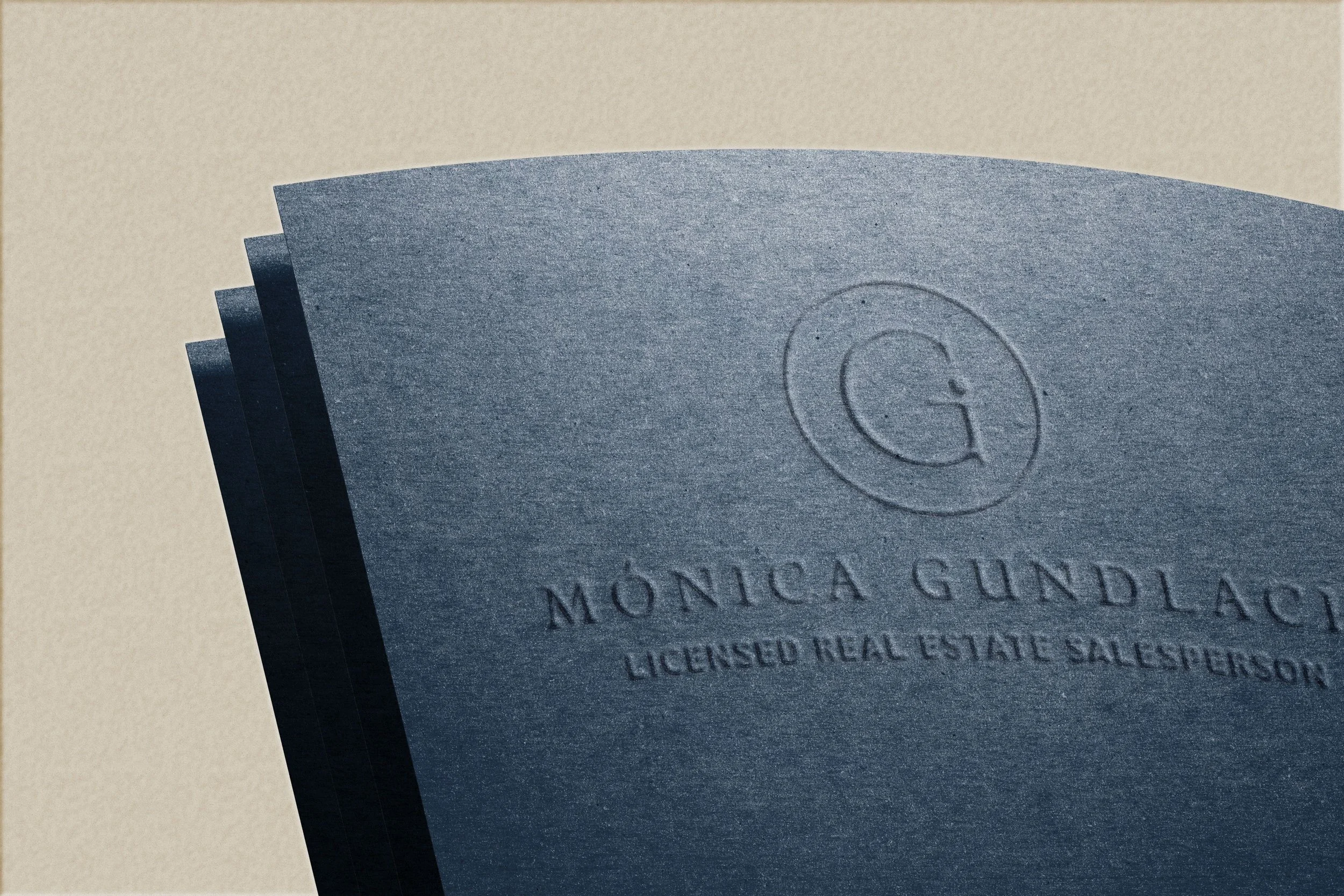
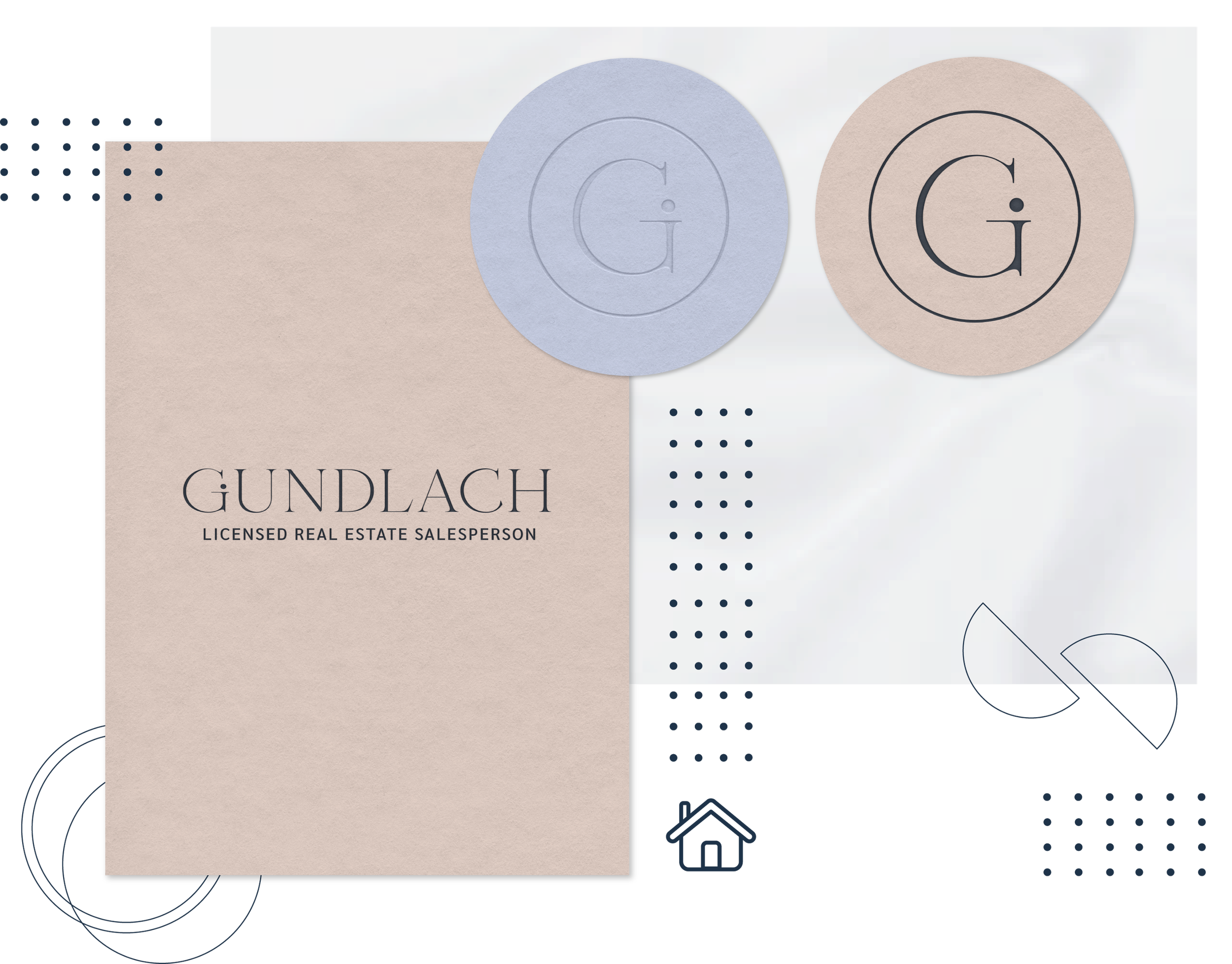
He had defined that, being a personal mark, some vowel or consonant of his name had to be the beginning of departure. I had a debate between the M, G and O visualizing the option that gave me more freedom and also that in his field not find monograms with any of them. So I started working with the G. Afterwards, I had to decide between serif or sans serif typography, both looked equally good. I chose the serif option because New York newspapers are part of that typeface. The newspaper is still one of the media outlets for real estate publications. Based on a sense of belonging, everything is united. Without using a specific font family, I started sketching from scratch. What I most wanted to spread was closeness and it had to be shown in an unconventional way. That's why I incorporated the circle located at the base of the closed counterform of the letter. Here it was not to invent but to work with what already exists and is continually observed.
BUSINESS CARD DESIGN
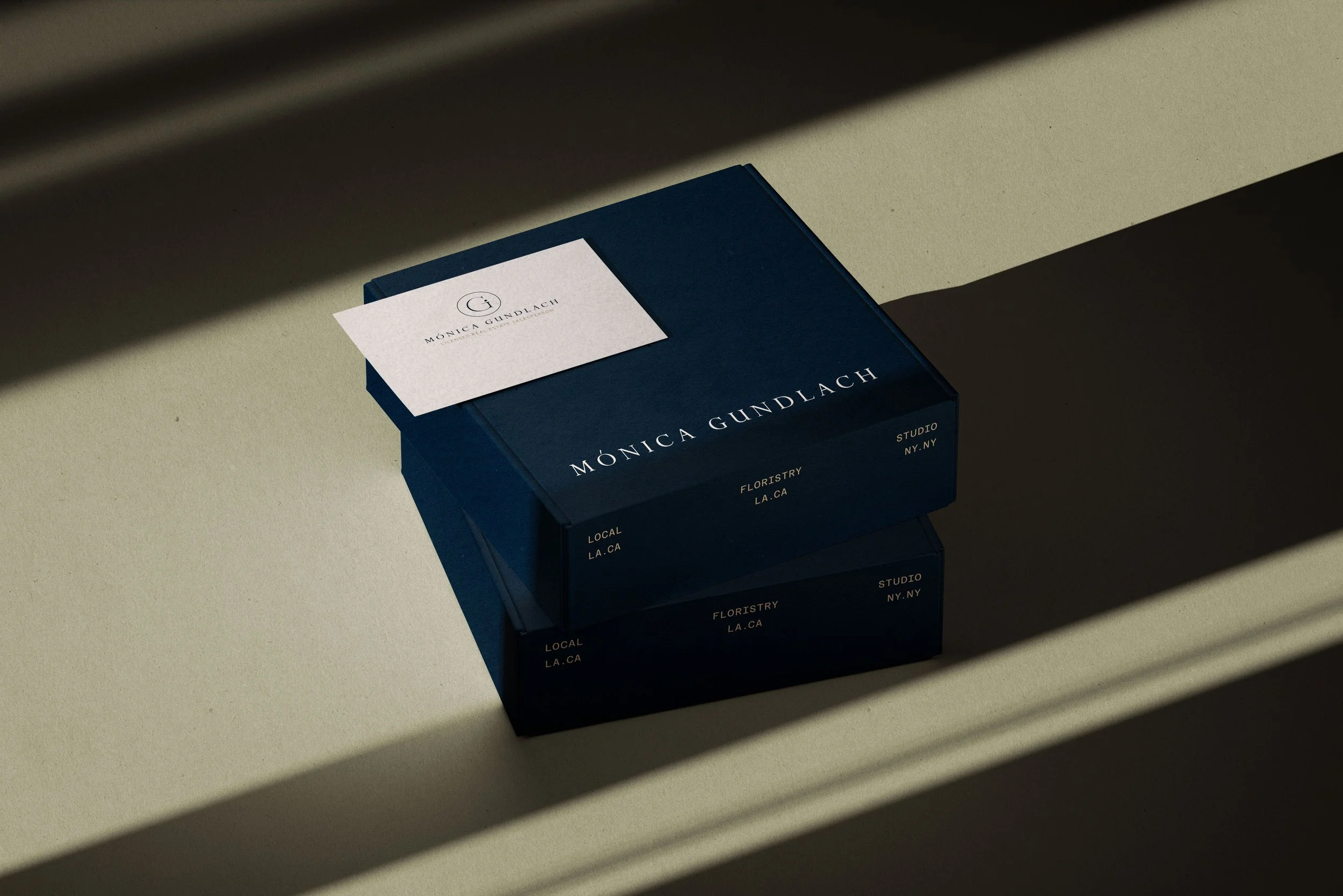
The design of the business card is out of the ordinary. A non-traditional design that is constantly remembered. I gave priority to closeness, so I began with a phrase that forms part of his narrative: "I started answering phones in a language that wasn't quite mine yet. Today, I open doors in what was always yours. Let's find together the place where your story finally settles. This, rather than closeness, is bonding and empathy in its splendor; that is where branding manifests itself and personal branding is remembered.
KEYWORDS REFLECTED IN THE TANGIBLE
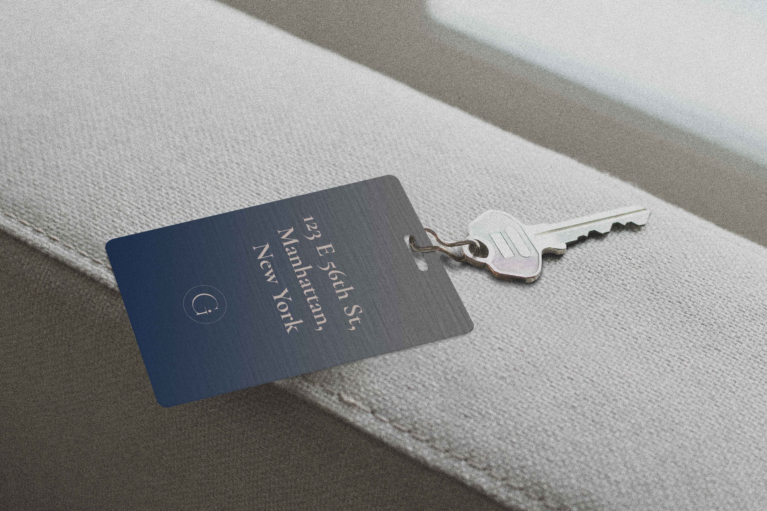
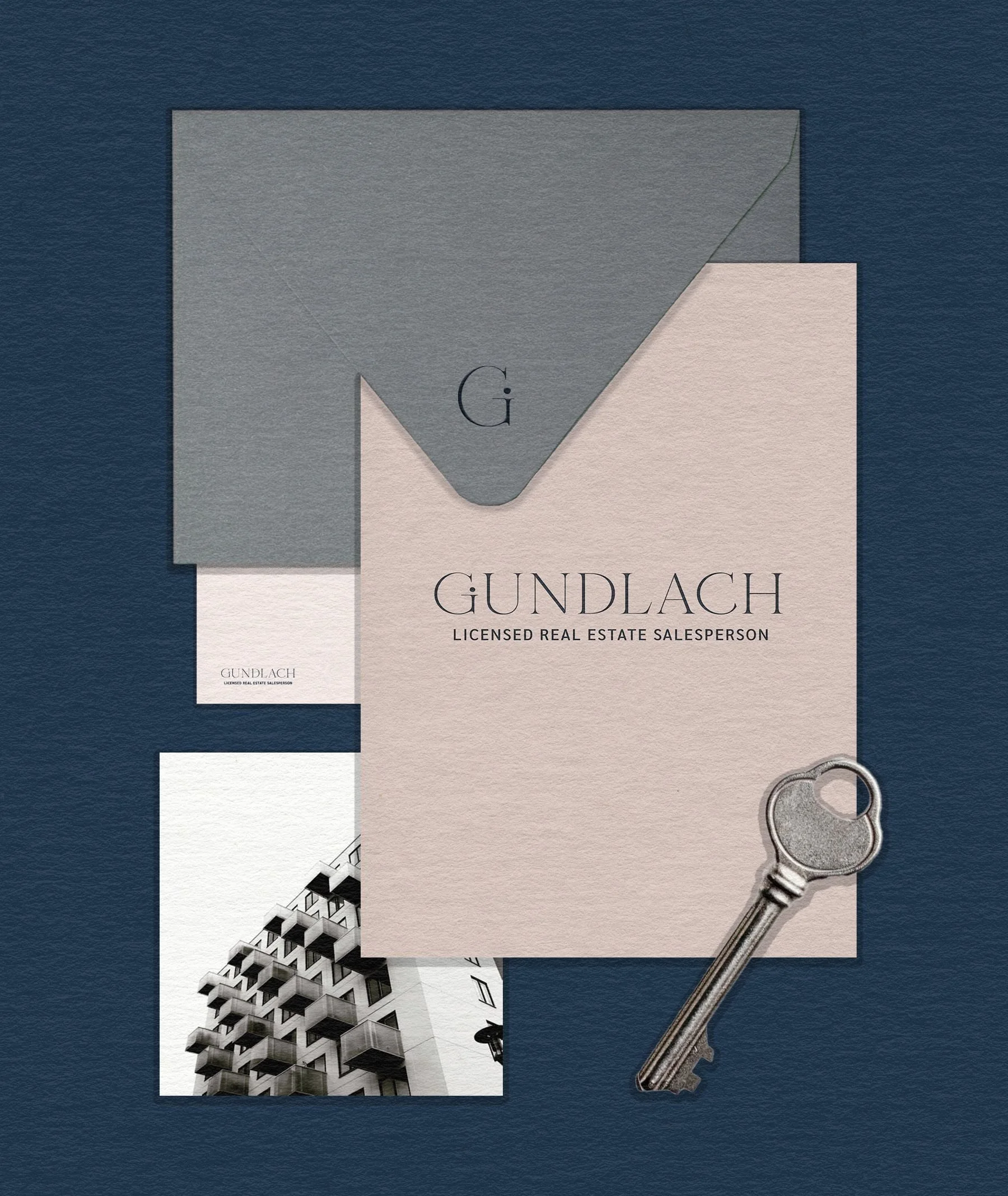
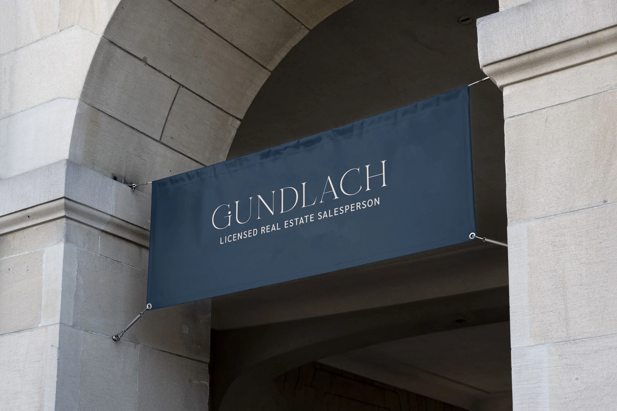
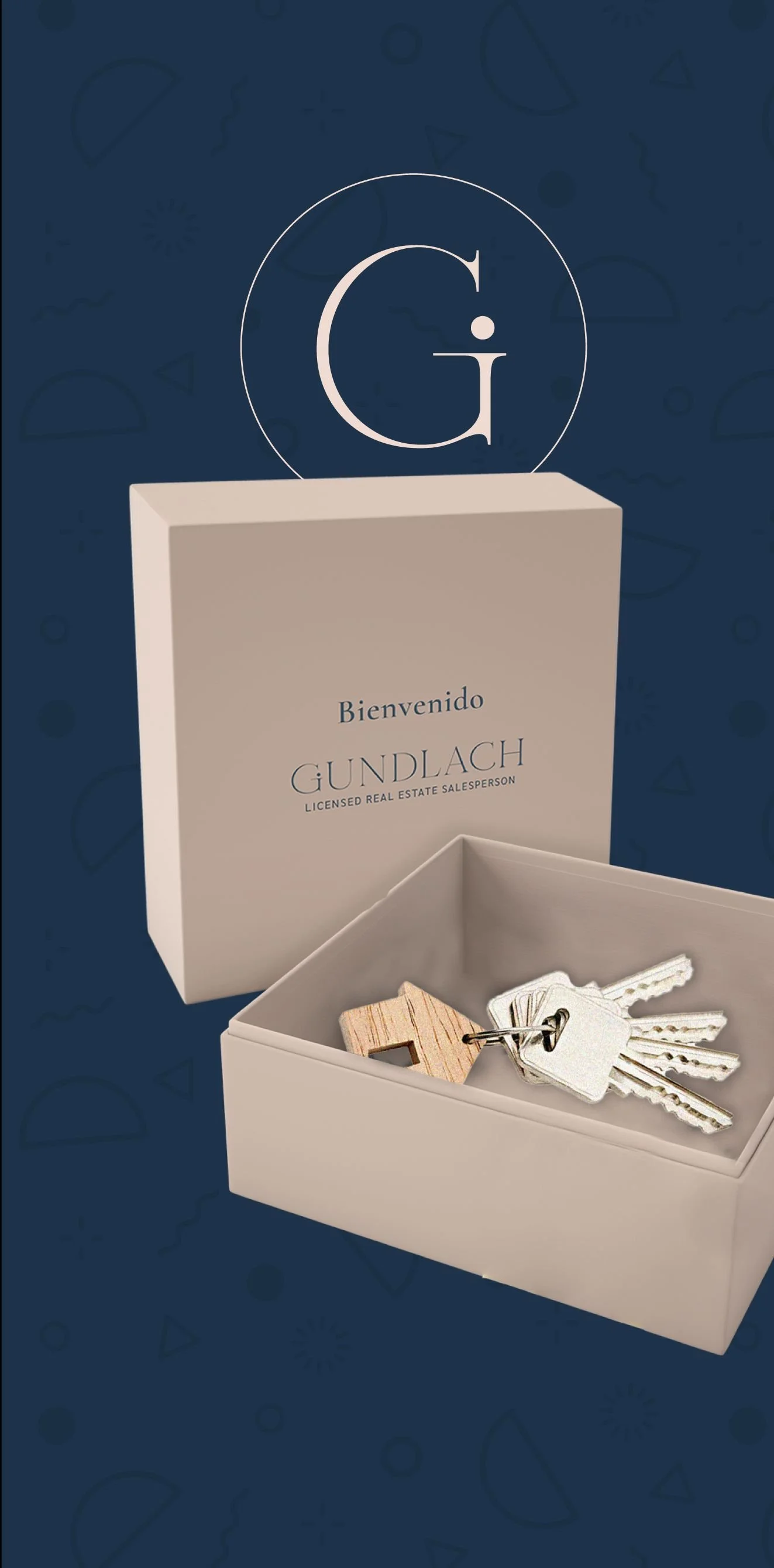
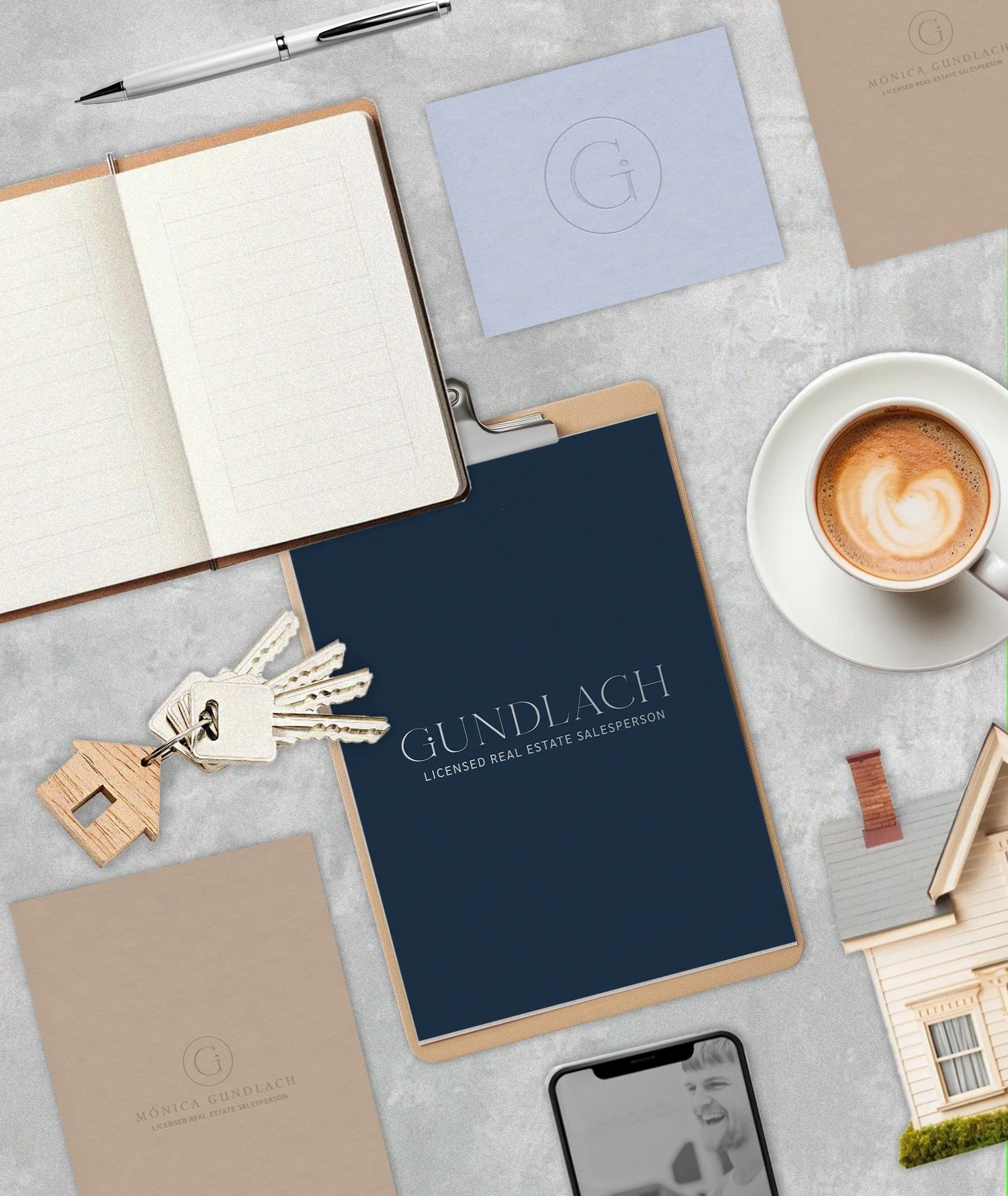
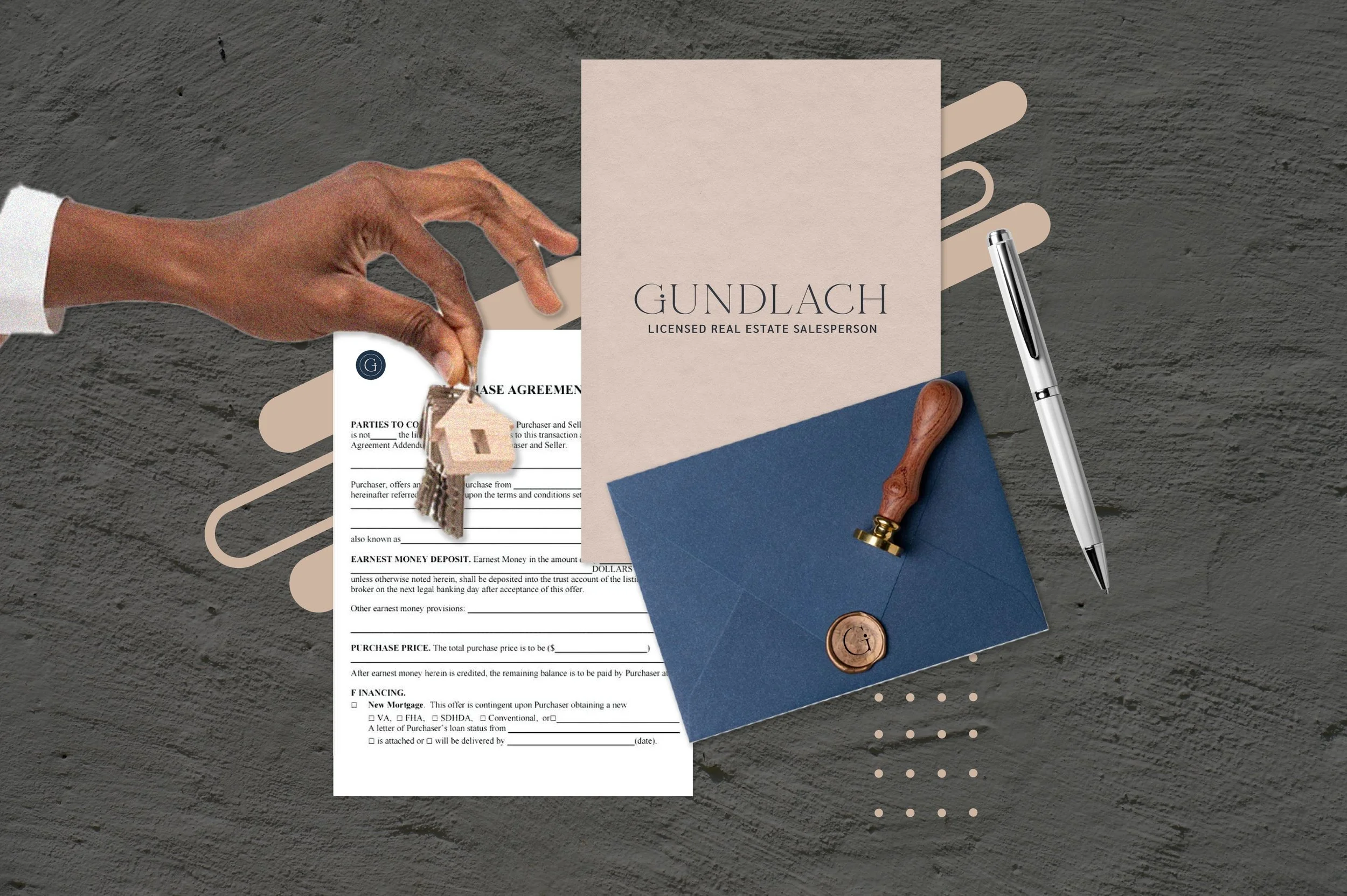
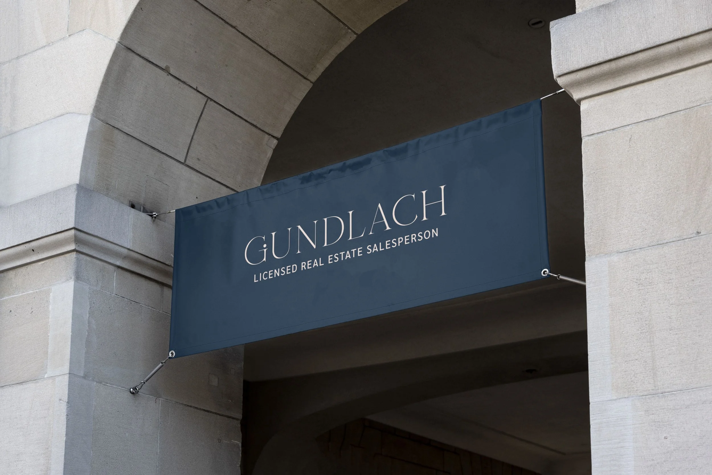
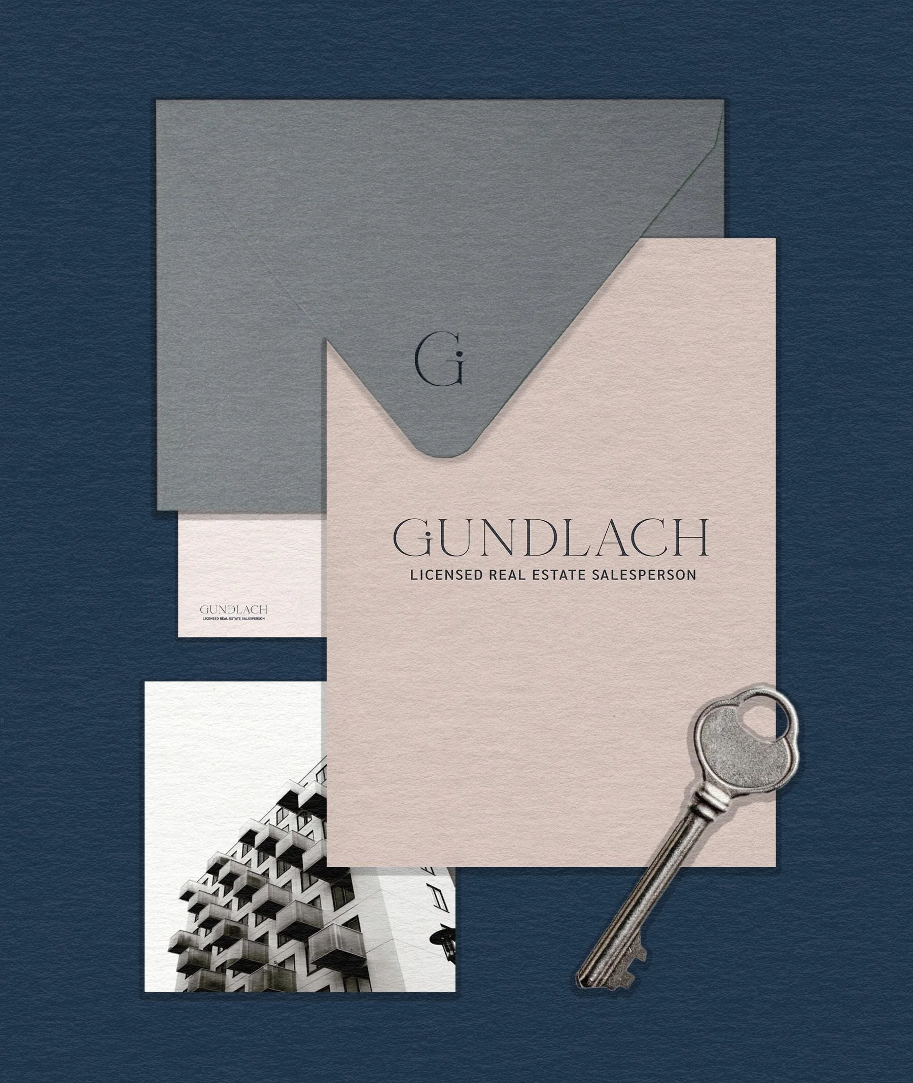
One of the most wonderful things that branding offers is the ability to tangibilize what is perceived. In this case, the group of keywords appears throughout the stationery of the trade mark. Here is a sample of the external communications envelope design. Sobriety should not always be boring; it can have the fun that is part of Monica's personality and this is reflected in the graphic resources of the envelope flap.
DEVELOPMENT OF VISUAL ASSETS UNDER ART DIRECTION
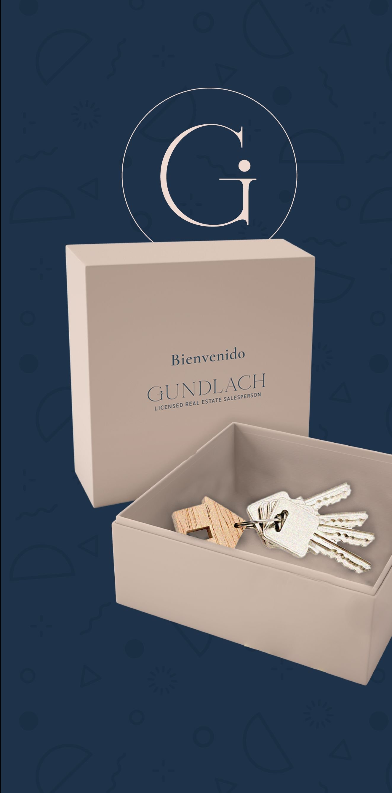
The visual narrative does not seek what is evident in the real estate service, but to build a shelter and support network. Through an editorial composition that balances the warmth of the organic — the touch of paper, the coffee break of the everyday and the technical precision of design where the criterion is not based on tastes but on long-term investment. The key is that the criterion can be shown so that credibility begins to take hold.
ANALOGUE PROCESS
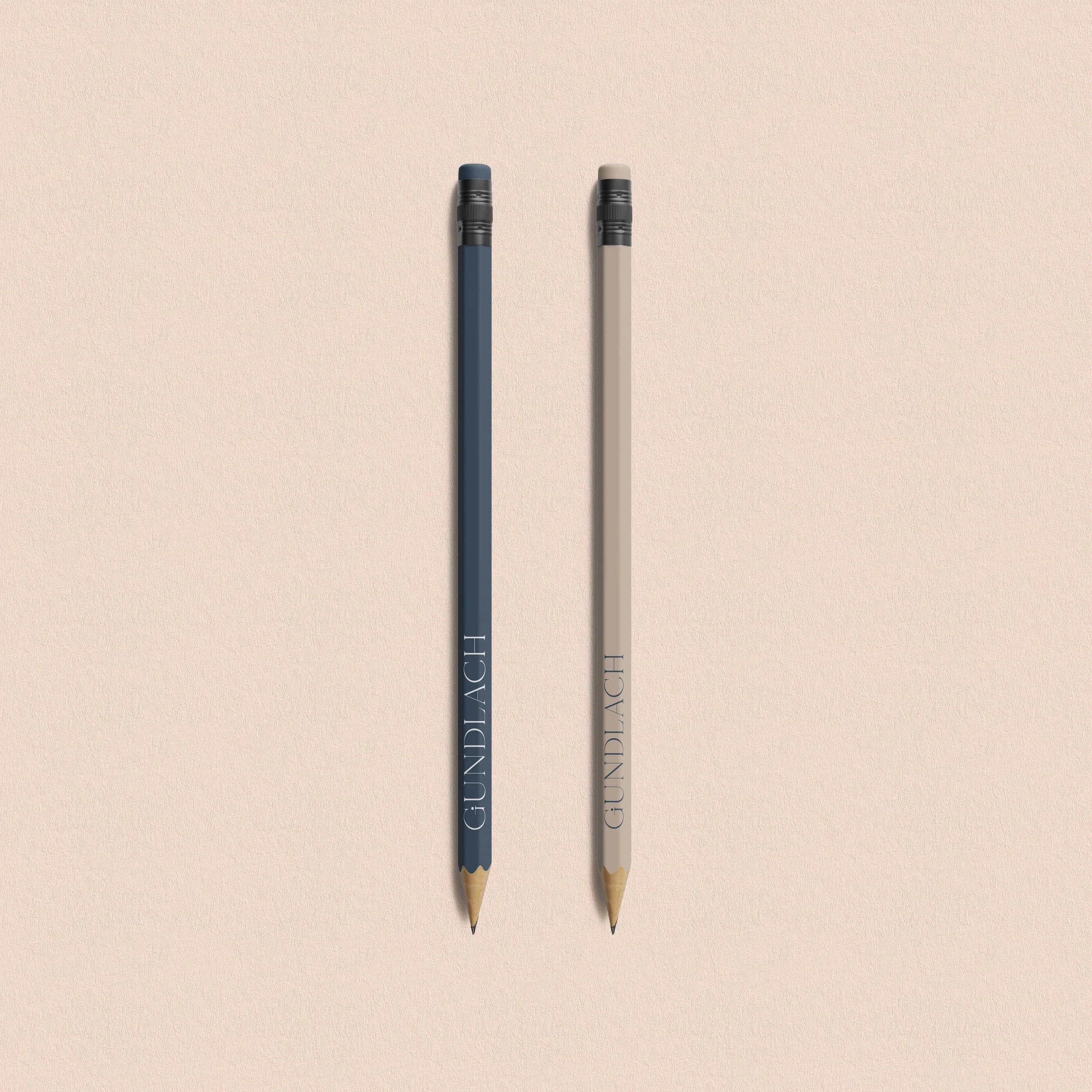
The textures are part of the supporting parts of the brand. In this case, I decided to put aside the closeness and let Monica's judgment and professionalism speak for itself. For the creation, I used the shading technique using the waxes from the colored pencil mines. I also added shadows of makeup that I blurred using my finger and cotton. To add brightness, I used makeup glitter. Finally, in Photoshop, I added a percentage of noise to provide more depth. These textures are displayed on your website and other brand elements.

[3] Photo of the 1st plane where the texture is 70% advanced. According to the need of the brand, the number of unique textures are created, although the processes are similar, the beautiful thing about art is that not everything comes out the same. For Monica, 1 piece of texture was created.

[2] The behind the scenes where I start with mixing colors using only colored pencils.


▪ The Pandora’s Box: What we discovered
-
Although Monica offered a high standard of service, her visual identity failed to reflect her professionalism and warmth. The absence of a cohesive image meant her presence often went unnoticed in a market where first impressions are everything.
-
Her value proposition was strong: comprehensive support and in-depth knowledge of the New York market. However, it wasn’t being communicated strategically, which limited her ability to connect with high-income Latino clients looking for proximity and trust.
-
Monica had the experience, reputation and results, but lacked a business and digital strategy to channel that value towards clear goals of visibility, lead generation and loyalty. Her online presence didn’t match the quality of her service.
-
In an industry where trust is everything, we developed a website that not only informs but also conveys her commitment and professionalism. The site became the first emotional touchpoint for potential clients and a space where her brand could truly come to life.
▪ The Challenge: Mapping the master move
The challenge with Monica Gundlach was to craft an authentic personal brand that would break away from the stereotypes of the New York real estate market, positioning her as a trustworthy and approachable expert focused on Latino families earning over $70,000.
At the market level, we defined a distinctive value proposition that highlighted both her professionalism and approachability, incorporating emotional marketing actions that resonated with the dream of owning a home—without the barriers of language or bureaucracy.
Internally, we developed a viable and sustainable business model through a thorough analysis of competitors, opportunities, and threats, allowing us to structure a long-term positioning strategy.
From a consumer perspective, we explored the genuine needs of her target audience and built tools to enable personalised support, strengthening trust-based relationships.
Finally, we integrated a social responsibility focus, supporting her interest in sustainable housing and helping her communicate this clearly—while encouraging active participation in local initiatives, reinforcing her ties to the community.
TRUSTWORTHY
PROFESSIONAL
APPROACHABLE
TRUSTWORTHY PROFESSIONAL APPROACHABLE
▪ Change in Action: Beyond What Meets the Eye

BRAND ARCHETYPE:THE HUMAN
During the creative process of Monica Gundlach’s personal brand, we developed a business and digital strategy that blended word-of-mouth marketing with Open House events, allowing families to experience what could become their future homes.
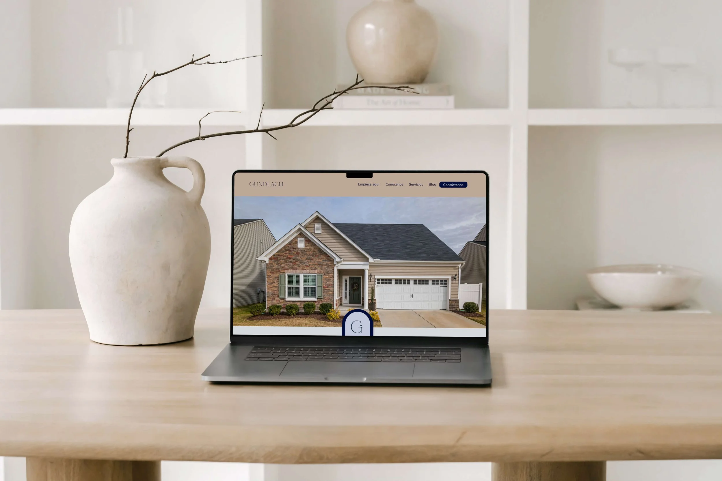
We designed a functional website with integrated forms and a booking system, enabling direct interaction and building trust from the very first contact.
For the branding, we worked under the creative concept ‘Break the Ice’, transforming the complexity of the property-buying process into something more accessible and human.
The verbal identity centred on messages of trust and progress, particularly aimed at naturalised Latino families; while the visual identity featured a monogram combining the initial of her surname with a human figure, softening the sector’s typically cold and impersonal perception.
The logo, constructed on a geometric grid, used a serif typeface with Venetian-style terminals, adding elegance and personality. The colour palette was carefully selected to evoke professionalism, integrity, and a sense of hope.
In this way, we built a purpose-driven brand—one that goes beyond aesthetics, anchored in strategy and emotional resonance.
▪ The debut on the web
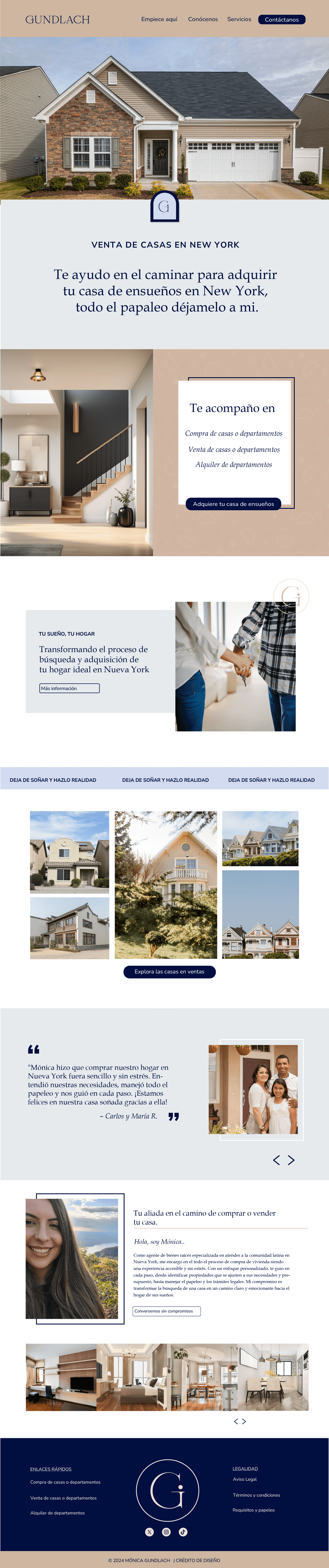
Monica’s website was designed as a key touchpoint to translate her story, values, and professionalism into a clear digital experience. More than just an online presence, the site became a space where trust is built from the first interaction — allowing potential clients to understand who she is, how she works and how she can support them through one of the most important decisions of their lives. Every element was thoughtfully structured to feel approachable, credible, and easy to navigate, reflecting her personal brand and speaking directly to Latino families who want clarity, guidance, and confidence throughout the process.
···
▪ Website features and techniques
-
Developed on: Squarespace
Version: Squarespace 7.1
Type of plan purchased by the client: Business
Website type: One page (Minimal & Essential)
Maintenance: The website is managed and updated by the client.
-
Smooth Scroll Navigation
Hero Image Parallax
Lightbox Gallery
Hover Reveal en secciones clave
Fade-in Animations en contenido
Sticky Header minimalista
-
Integrations: Newsletter with MailerLite, booking system with Acuity Scheduling, Analytics.
Optimisation: Basic SEO, optimised image loading, mobile-first design.
▪ Results: What we achieve together
The launch of Monica’s website marked a turning point in how her personal brand connects with potential clients. What once relied on word of mouth and scattered communication is now supported by a clear, trustworthy digital space that actively works in her favour every day.
-
In the first two months after launch, the website generated 12 Open House bookings directly through the contact form, turning visits into real conversations and qualified prospects without manual follow-ups.
-
With a clear structure, warm tone and intentional messaging, Monica’s website now communicates credibility from the first click, helping boost confidence in her services and positively impacting her results and sales.
-
The new site works as an active sales tool, making it easier for potential clients to understand her value, reach out and book — allowing Monica to focus on closing deals while the website supports her day-to-day business.
▪ Classified file: Additional data
INDUSTRY: Real Estate Agents / Brokers
LOCATION: New York, United States
START OF BUSINESS OPERATIONS: 2020
PROJECT COMPLETION: 2024
▪ Behind the scenes: Team credit
BRAND DESIGN & WEBSITE DEVELOPMENT: Creative House by María Fernanda Ayala
COPYWRITER: Sandra Voltinaer
ANIMATIONS: Héctor Terreros
CREATIVE & STRATEGIC DIRECTION: María Fernanda Ayala




A kind note from the client
“My website shows how close my brand feels.”
Before working with Networking, I knew what I wanted to represent, but I didn’t know how to communicate it clearly. The New York real estate market can feel cold and intimidating, especially for Latino families, and I wanted my brand to feel different — more human, more approachable, and still professional.
Mariffer immediately understood that. Together, we built my personal brand from the inside out. We worked on my messaging, my values, and the way I speak to my community, so my brand truly reflects who I am and the families I want to support. Today, my brand feels authentic, warm and trustworthy — and that has made a huge difference in how people connect with me.
My website looks amazing and actually works for me. It feels clear, welcoming and easy to navigate. In the first two months after launching it, I received 12 Open House bookings directly through the website’s contact form, something that never happened before. Having a space where people can reach out and book with confidence has helped boost my results and my sales.
What I value the most is that this wasn’t just about a website or visuals. Networking helped me structure my business, clarify my value, and position myself with purpose — including my commitment to sustainable housing and my involvement in the local community. Today, my brand truly represents me, and my website supports my growth every single day.
— MÓNICA GUNDLACH, PERSONAL BRAND (USA)