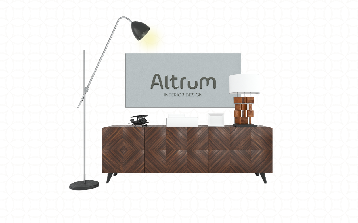
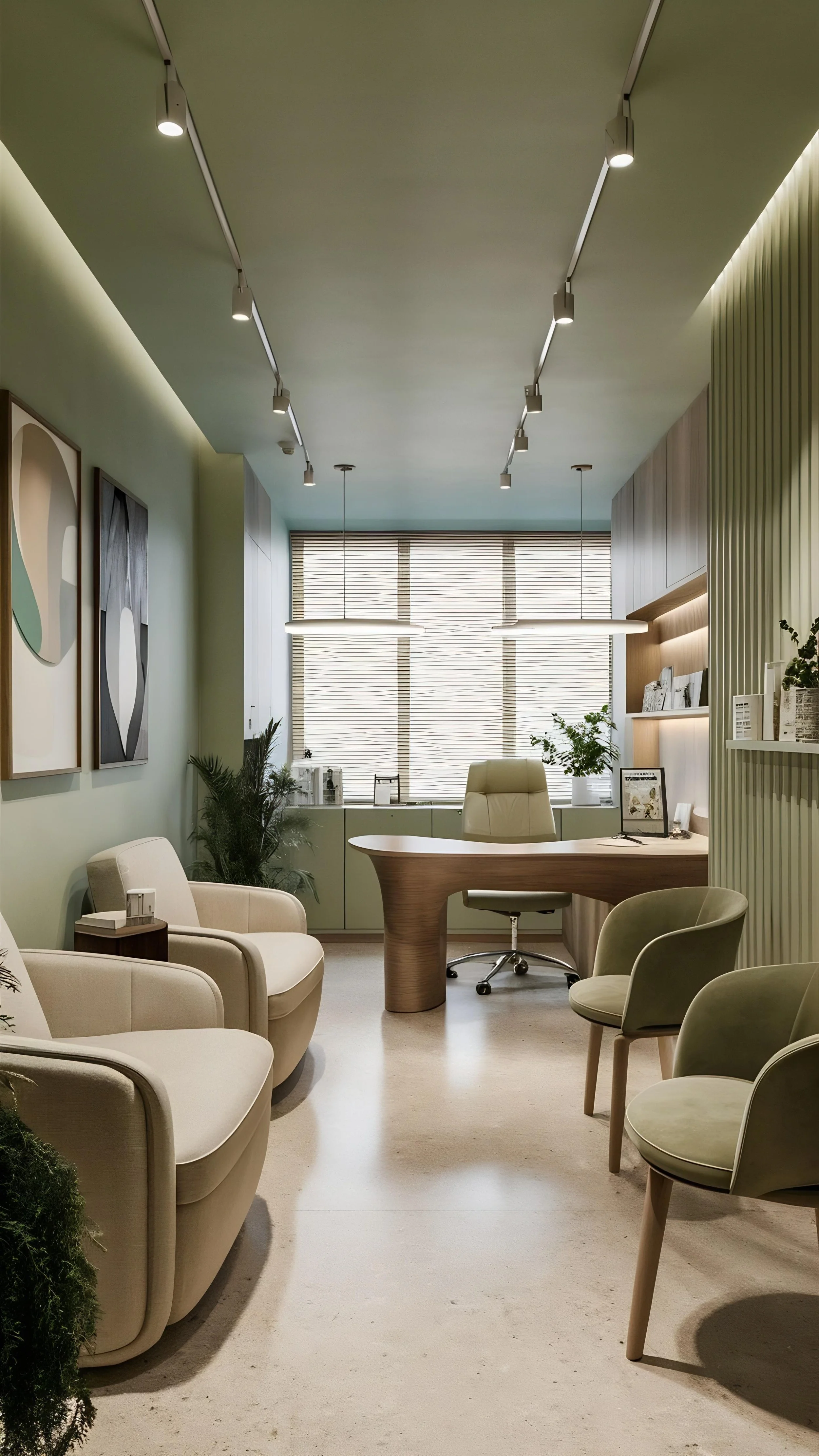
Carolinne Altrum—Corporate Interior Designer & Scenography
Bringing character and purpose to corporate spaces and experiences.
Carolinne Altrum is an interior designer based in Toronto, Canada, focused exclusively on corporate interiors and scenography — offices, coworkings, corporate headquarters, events and exhibitions. For the past two years, she's taken on independent projects on the side, while working full-time in the industry.
clarity
nuances
moderm
accuracy
Inside the project
Client location: Toronto, Canada, North America
Project tasks: Brand Creation and one-page Squarespace website
Brand Creation & website development: María Fernanda Ayala, SAADLI® — Casa Creativa
Creative & Strategic Direction: María Fernanda Ayala
Copywriting: Sandra Voltinaer
About the project
Carolinne fell in love with commercial interior design during her internship, which quickly turned into a full-time job. For two years she juggled her day job with freelance projects, until one day she decided to take the leap and go out on her own.
Getting to know how she works, I saw two things that defined the project: technical precision and creative freedom. From there, I set a brand direction built on clarity, which also brought in modernity, accuracy and nuance.
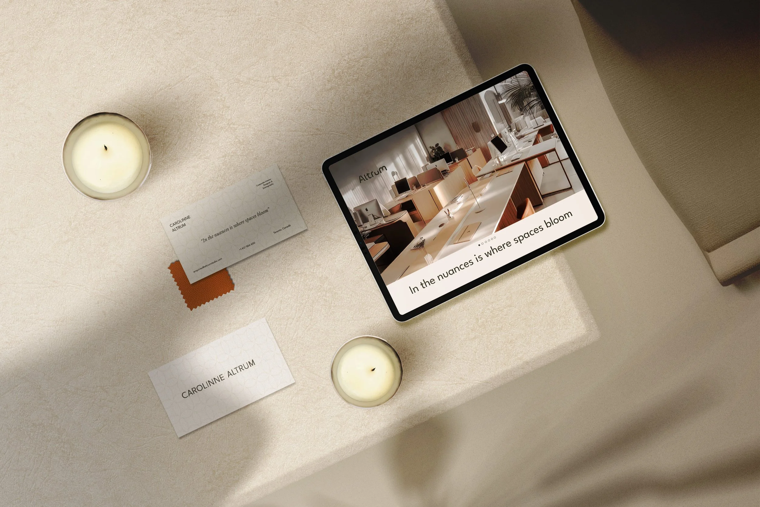
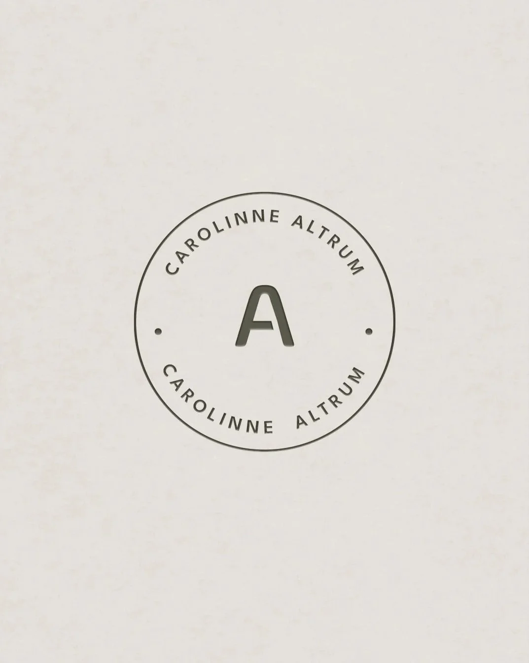
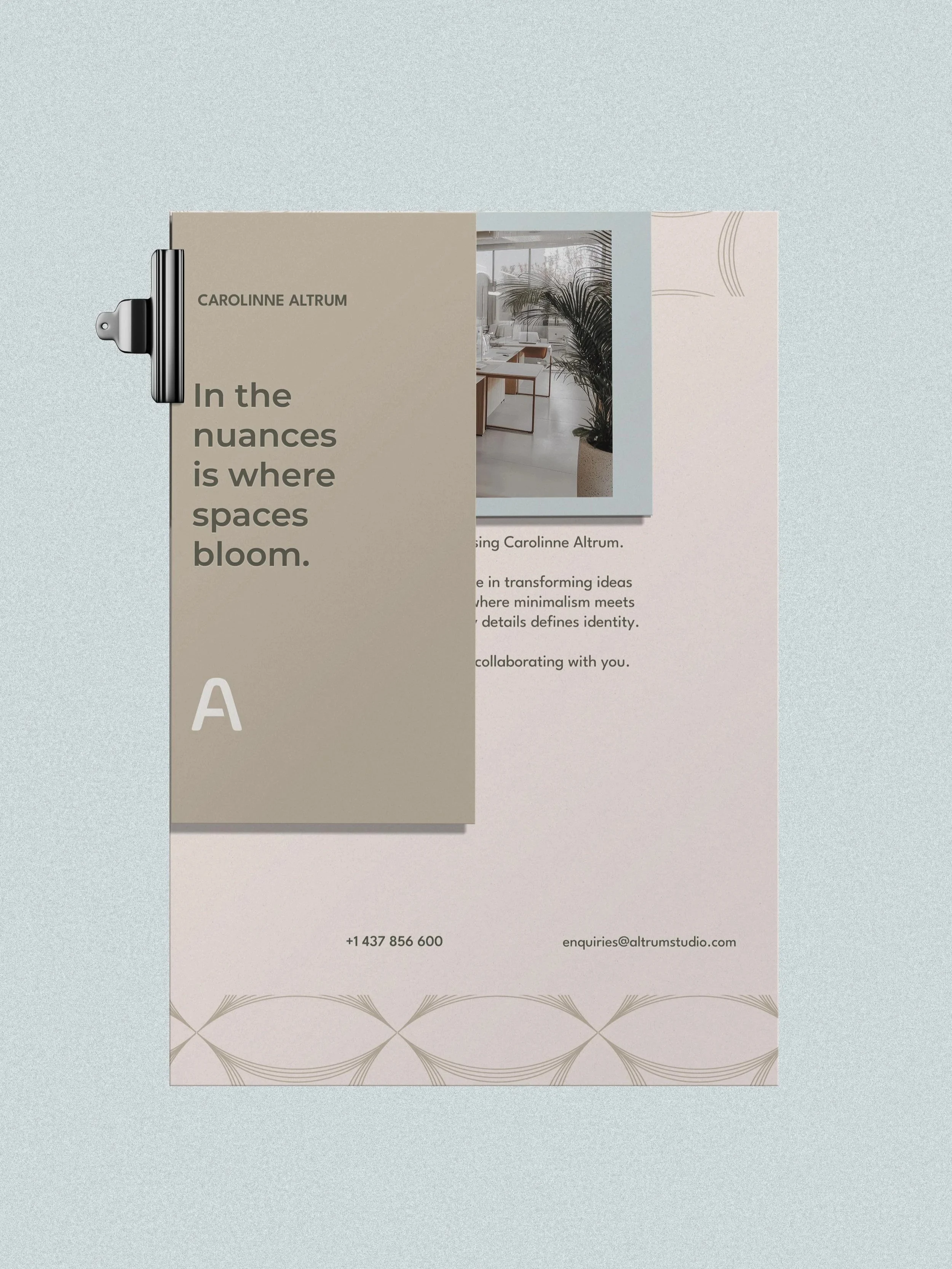
I wanted her personal brand to stand out without boxing her into her profession, so I went with ALTRUM, her first surname: it’s one of a kind, easy to say and uncommon in Canada. I worked with Carolinne on the verbal identity and the tagline “In the nuances is where spaces bloom”, the idea being that it’s the details and small variations that give each space its personality.
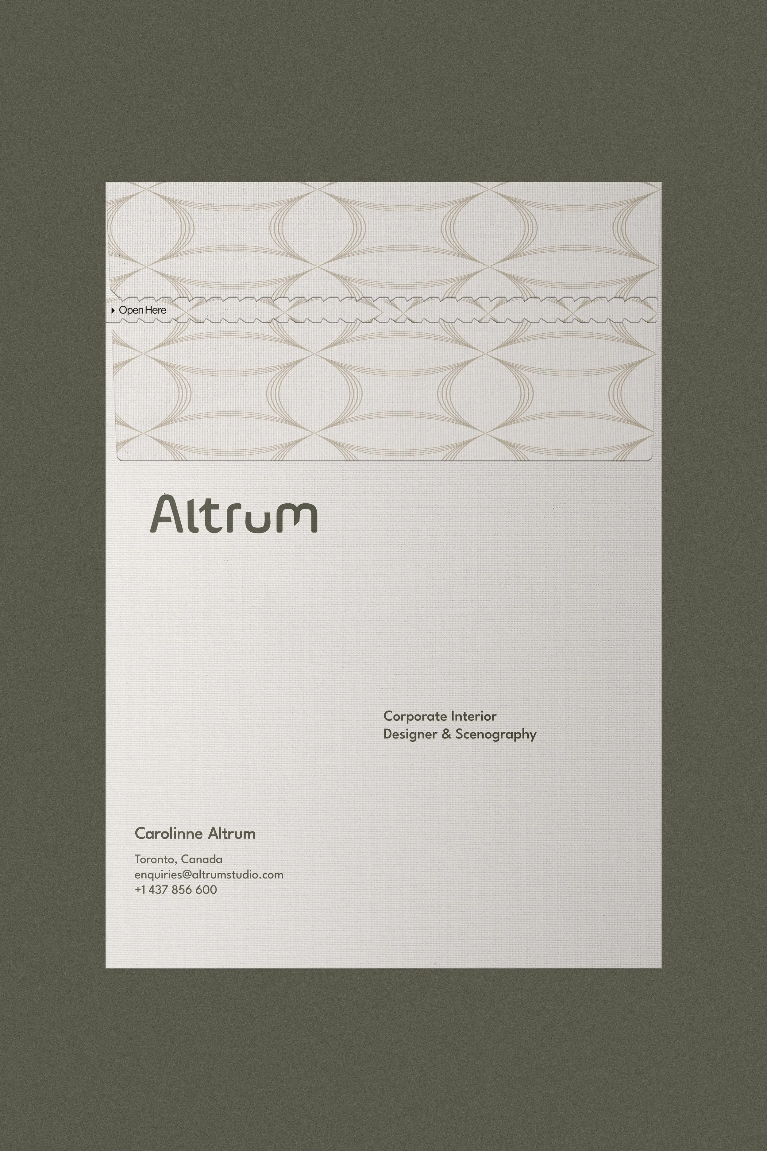
On the branding side, I wanted to bring something different to what you usually see in the industry. I chose a serif typeface with rounded terminals and the odd irregularity to capture that mix of technique and creative sensitivity.
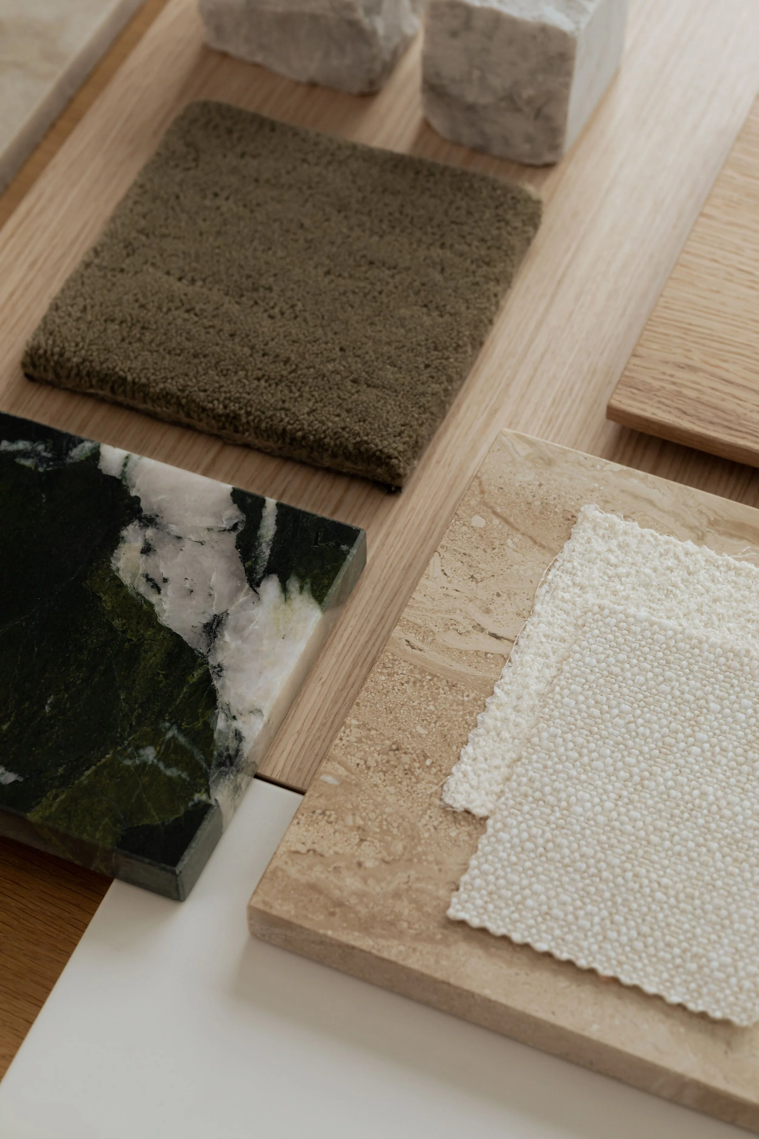
The colour palette is inspired by nature and the materials she works with in her projects. The sensory branding comes through in an organic texture, used across a range of merchandise.
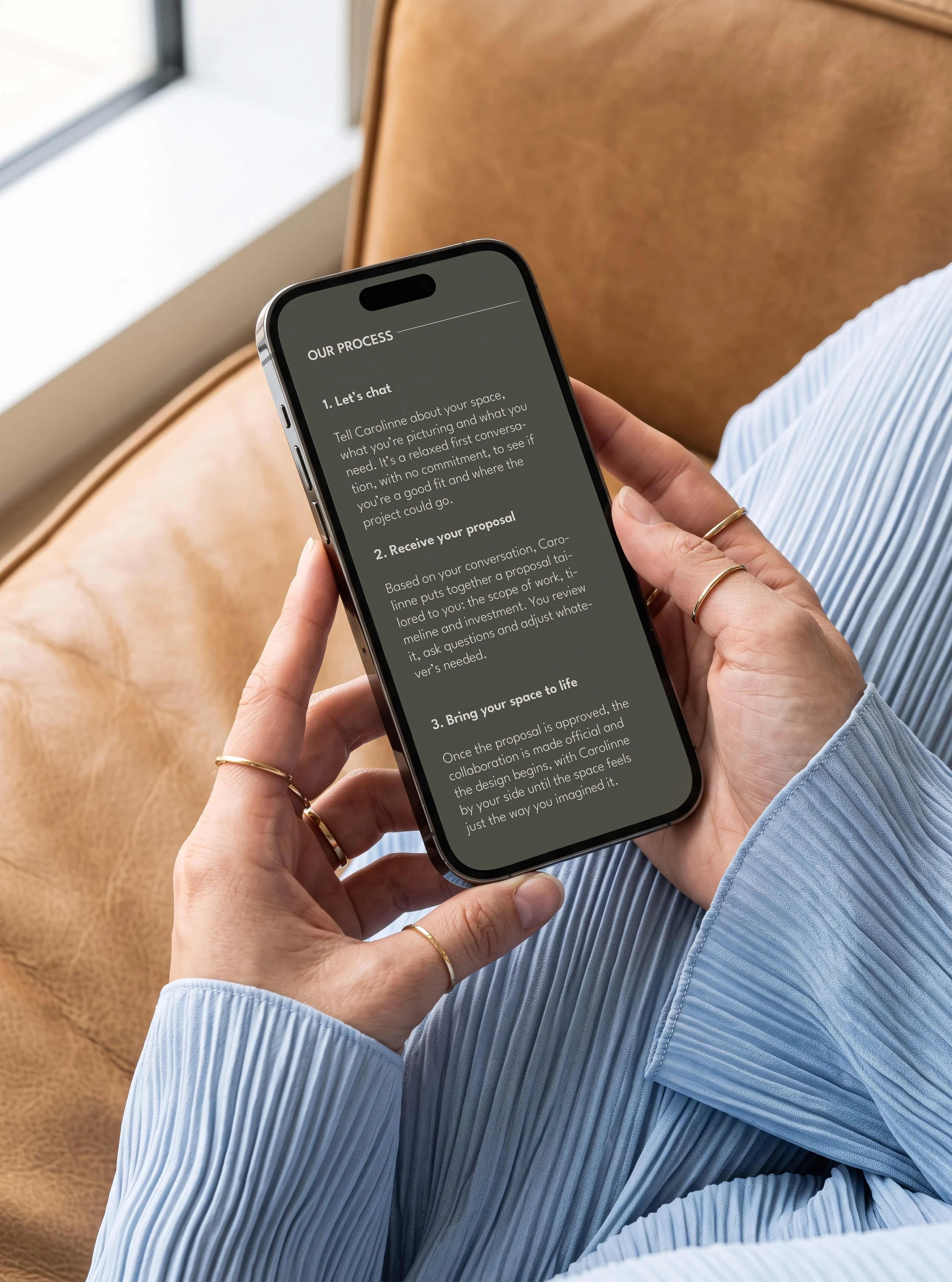
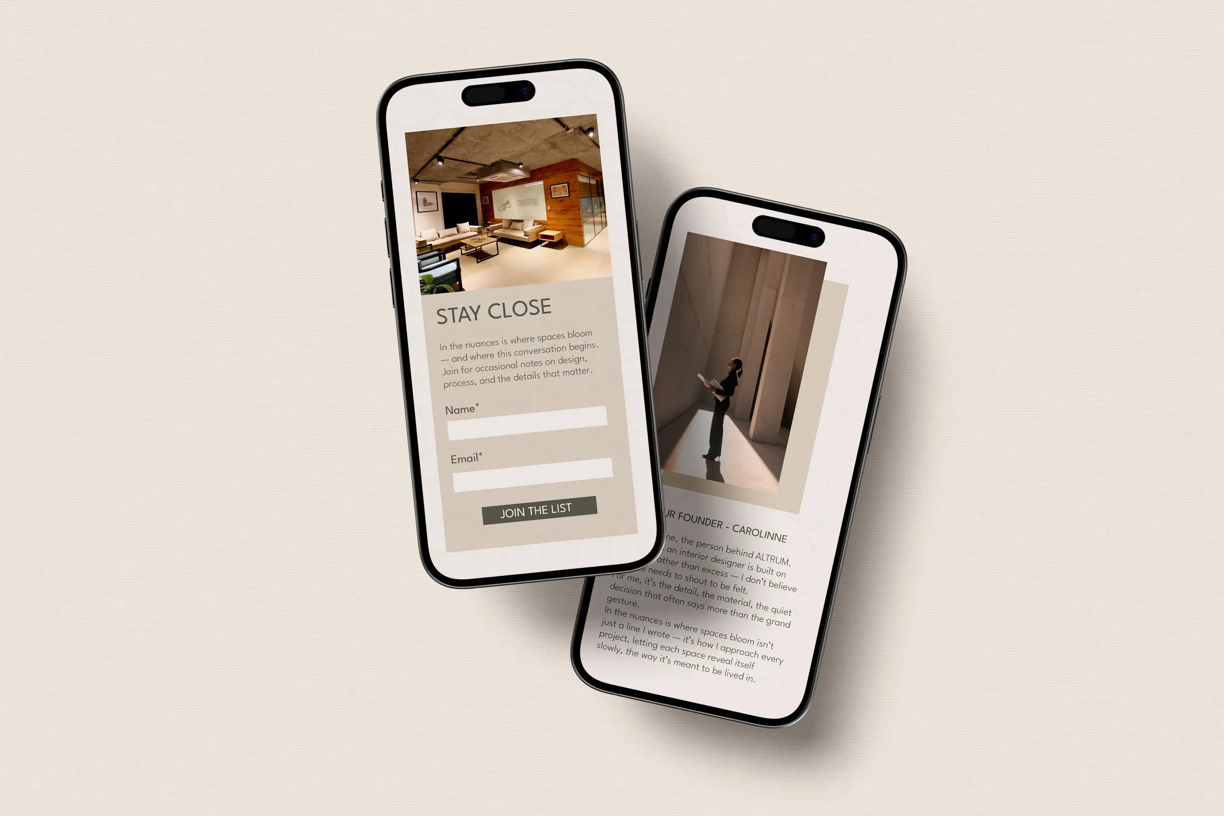
To help her go from four to six projects a year and explore opportunities in the US beyond referrals and industry events, I built a one-page website on Squarespace.
I designed an experience that makes visitors want to stay, connect with her work and come back to it.
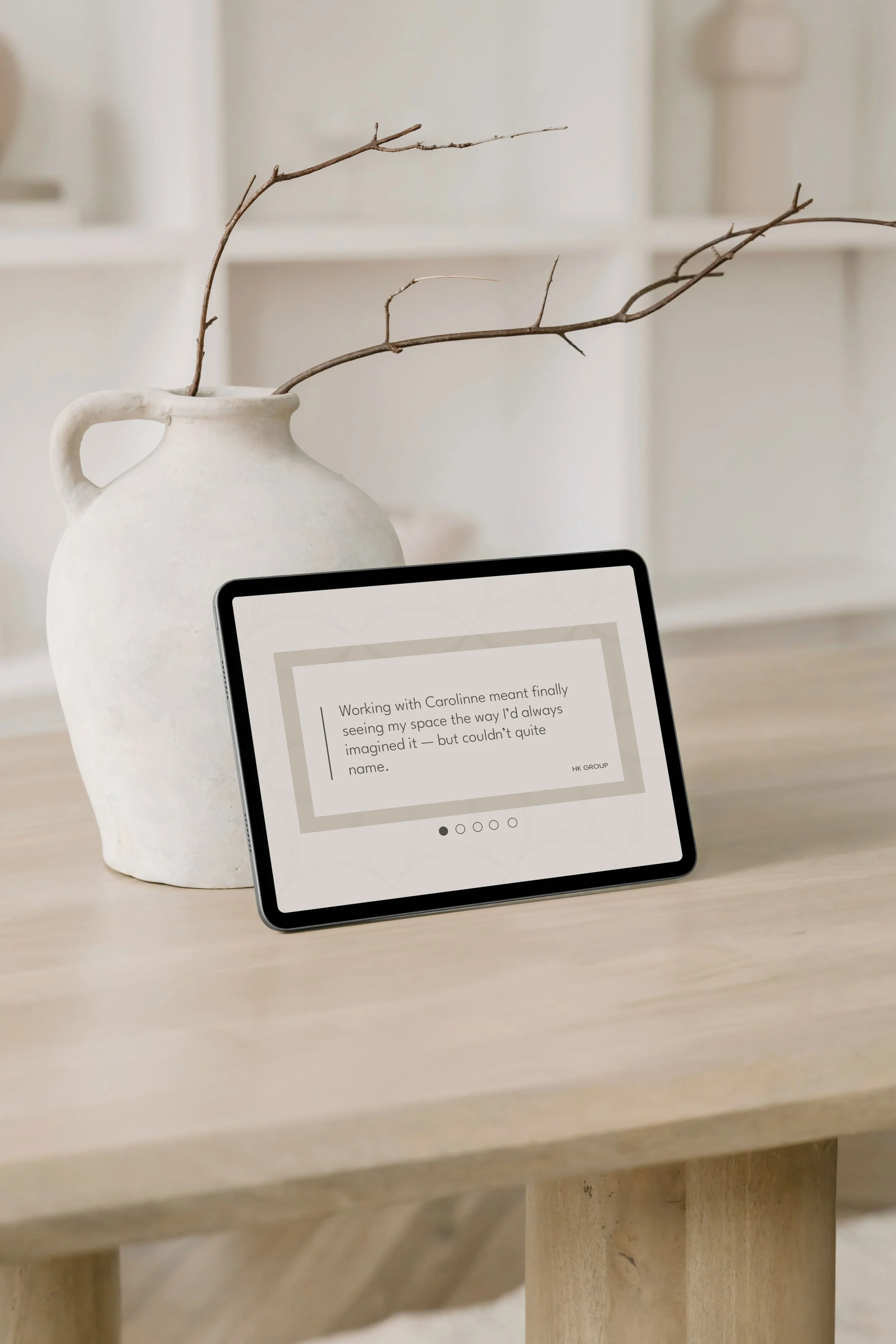
The site is optimised for SEO and has a newsletter to share trends and lay the groundwork for future products designed by Carolinne, plus a pop-up form to book consultations. Smooth navigation, galleries and subtle animations round off the experience. These days, Carolinne looks after the site herself.
Two months after the brand launched, she’d already landed a new client in Toronto. Three months after the website went live, her list had grown from 10 to 40 subscribers. And she’s since identified five leads who are close to signing.


INSPIRATION FOR THE PROJECT
Inspiration came from Sunset on Mount Chocorua, New Hampshire, by William Trost Richards. In his landscapes I found the balance between precision and creative freedom that he sought for ALTRUM, as well as the color palette that gave rise to his identity.
WHERE TWO WORLDS COEXIST
Always the mapping of words allows me to know the breadth, territory, opportunities and direction prior to the construction of the brand.
LOGO CONSTRUCTION
A label that communicates softness and nature; the floral embraces the textile, creating an identity that transcends the functional to become an emblem of the garment.
PHOTOGRAPHIC DIRECTION
This is one of several scenes created without the use of AI, combining visual atmosphere with natural inspiration, forming part of the brand’s visual and sensory identity.
ALTRUM was born to give shape to a one-of-a-kind way of seeing corporate spaces, where technical precision and creative freedom strike a balance. An identity and a digital home built to express that vision and take it on to new opportunities.

“Growth begins when you find a position of your own in the market, rather than competing for a space everyone else is trying to occupy”.
—Mariffer Ayala
editorial note