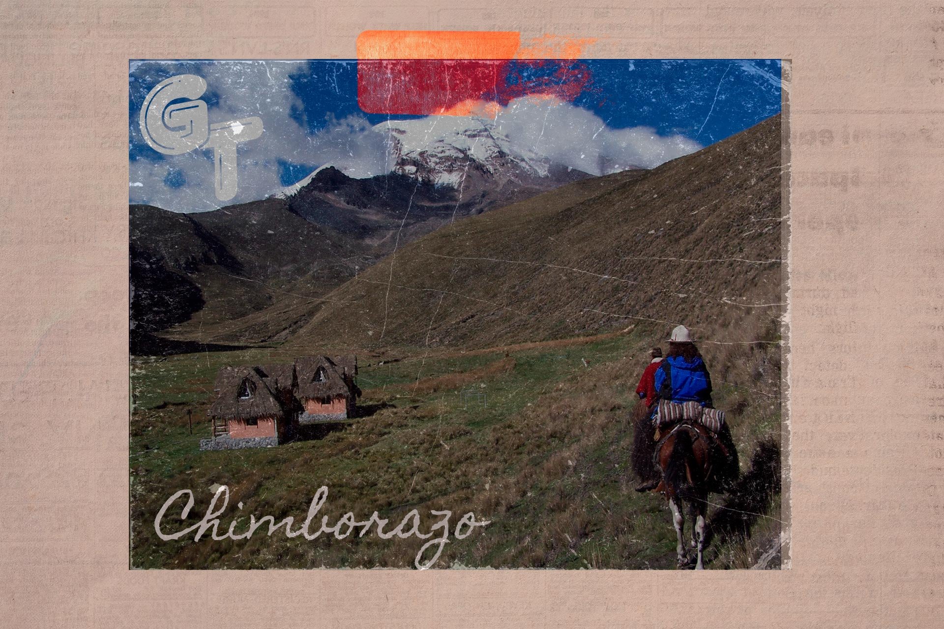
Galand Tours — Ecotourism agency
ETHOS
Promoting tourism as a respectful and conscious activity, Galand Tours was born to pay tribute to the geological and natural wealth of Ecuador.
His proposal seeks to take advantage of the country's privileged location to encourage domestic or foreign travellers to discover their four worlds in one: Costa, Sierra, Amazon and Insular Region.
Through excursions and other sustainable activities, Galand Tours invites you to reconnect with the memory of the territory by protecting the identity of the villages and the history of each area.
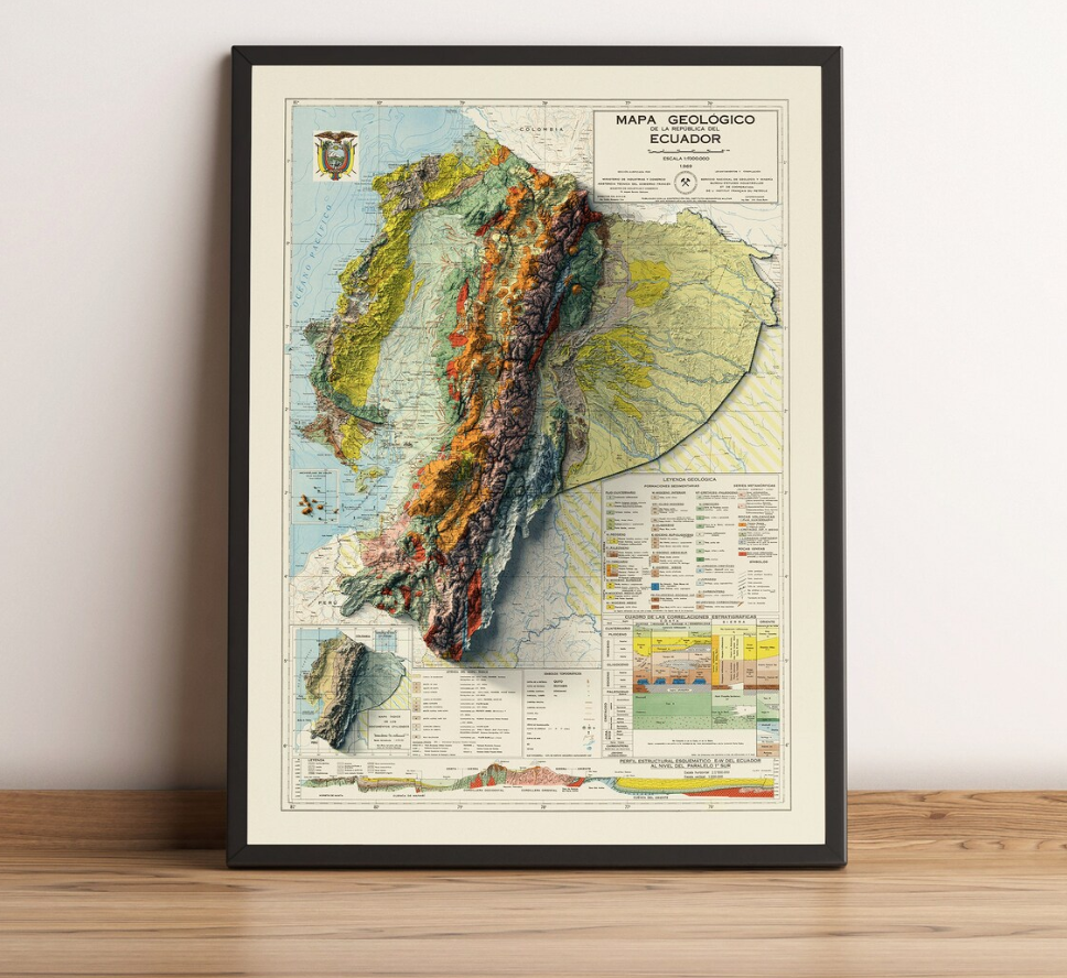
04.1(i) GEOLOGICAL MAP OF ECUADOR (1969) – IN THE PUBLIC DOMAIN▪ Overview
Founded in 2016, Galand Tours built its way into the ecotourism sector.
They prioritised authenticity and traveller satisfaction first and foremost. For the owners, however, visual identity was not their priority. This changed when faced with the demands of a post-pandemic market.
At that moment we started working with a deep brand audit[1], faced with the new demands, followed by the construction of its branding. In later years we worked with them again and there we audited their social networks[2],the same ones that did not reflect even closely what made them different.
What distinguished them most — responsible tourism, the real commitment to sustainability — was not communicated. Everything was tied to content that didn't do him justice.
There was the opportunity: to turn a genuine ecological purpose into something solid and coherent, both indoors and on every screen.

[1] Notes in my planner mid-meeting — the findings that mattered, the openings I could see, the exact point where things had started to go wrong.

[2] Cleaning the numbers, then watching where the clicks actually went — SPSS and heat maps telling me more about their audience than any brief ever could.
▪ Evolution
The work consisted of translating the data obtained from the audit into the construction of the universe where the brand could scale. Given that its target audience was attracted by the experience rather than its trademark, the challenge was not to convince, but to keep remembering, and that was how its brand strategy was born.
Hand in hand, visual, verbal and sensory identity evidenced the profile of the contemporary traveller, whose main motivation is sustainability and commitment to the environment that leads him to visit Ecuador.
Finally, through social media auditing, we connected how the brand lived internally with the way it was presented on social networks. So their networks stopped being passive storefronts in active channels of a company that was finally saying what it was for.


PENCIL SKETCH MONOGRAM
This pencil sketch features the bespoke monogram derived from the brand’s initials: GT. Executed via an intentionally modified sans-serif typeface, the anatomy maintains strict width proportions and character openings, enhanced by manual white highlights. In the letter G, the stem features a precise inclination that echoes the Organic Archive visual atmosphere, while the horizontal crossbar of the T terminates in a structural dotted node that seamlessly intertwines with the G. This achieves a mathematically cohesive composition while respecting optical kerning.
ILLUSTRATION INSPIRATION
In order to maintain the brand's narrative, it was decided to incorporate custom-developed botanical illustrations. The customer prioritised the endemic flora of Ecuador. During the investigation, we found some images belonging to the archive of Henri-Louis Duhamel du Monceau, among them that of Styrax officinale of 1768, which served as inspiration. In contrast, the wildlife is presented through its own archive of expedition photographs of the agency, leading life within its facilities as an interactive gallery, where visitors can zoom, move and tap the panel to discover the history behind what they are living.
HIGH-RELIEF ISOTYPE APPLIED TO THE COLOUR PALETTE
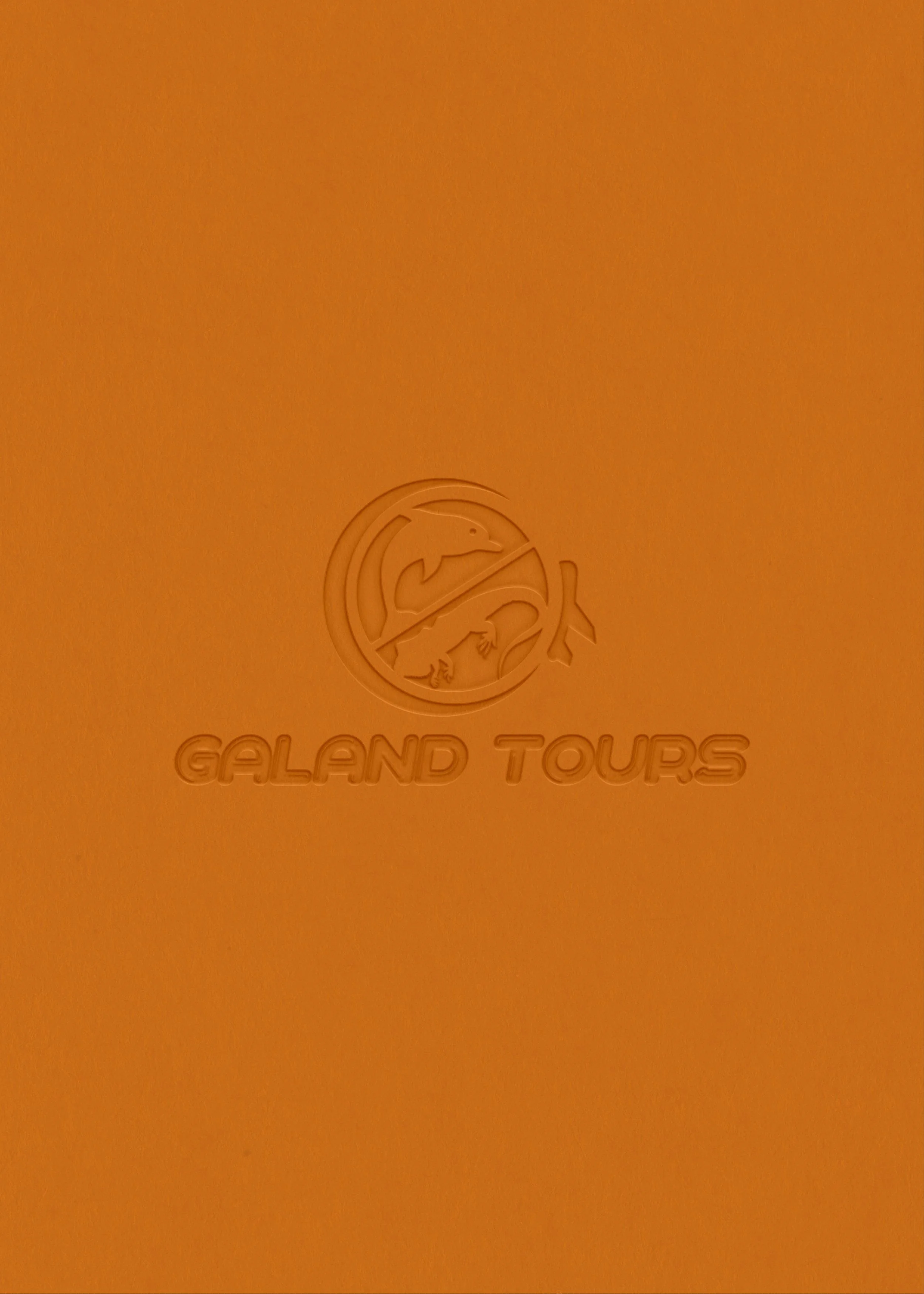
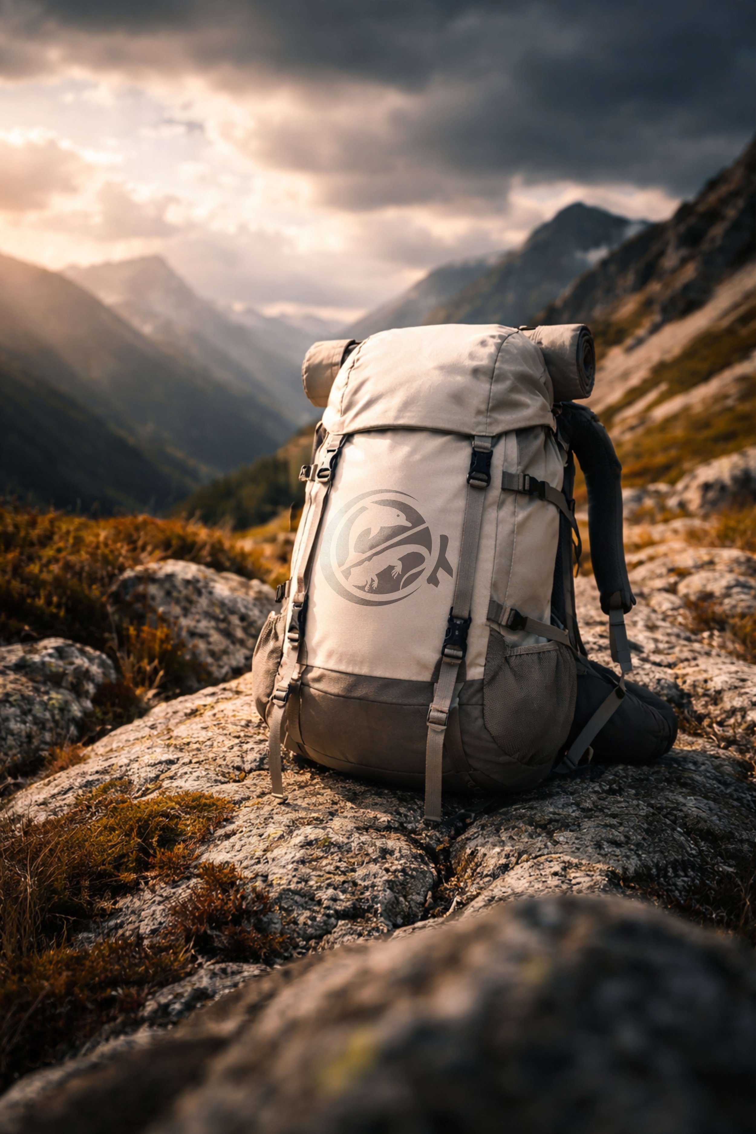
The chromatic landscape is directly informed by organic substrates, meticulously codified to represent Ecuador's unique geography: Green Pigment, Earth Yellow, Ocean Blue, White, and Almond. These tones are named in strict alignment with both the narrative theme and the Organic Archive visual atmosphere. This curated palette provides the precise contrast for the brand’s isotype—a minimalist, high-relief synthesis inspired by the territory's protected wildlife. Rather than using generic travel iconography, the symbol features the geometric silhouettes of Galapagos iguanas and coastal dolphins, acting as clear badges of regional authority across all print and digital applications.
PHOTOGRAPHIC DIRECTION
We decided to use the agency's own archive, along with other photographs we took ourselves, to create two visual worlds in which photography documents expeditions and shows wildlife in its natural environment. These images are presented in the gallery located on the agency's premises. The result is a carefully curated good documentary archive that elevates the travel experience above the conventional.
AUDITORY SENSORY IDENTITY
As a critical component of the sensory identity, the acoustic composition Nightfall (Roa Music, 2020) was selected to translate the Organic Archive and The Memory of the Earth concepts into sound. Its sonic landscape evokes deep contemplation, discovery, and respect for the ecosystem, embedding the brand into the traveler's emotional memory. This asset transcends standard marketing music, engineered to accompany diverse physical and digital touchpoints—from the agency's premises to cinematic audiovisual content—conditioning the client for an elite exploration experience.
ANALOGUE PROCESS
This bespoke texture acts as a cartographic abstract of Ecuador’s four diverse ecosystems. Developed through a hybrid technique, it features a controlled digital grain simulating the coastal shores, seamlessly merged with physical, high-relief ridges sculpted via an impasto palette knife technique to represent the Andean Sierra. Set against a raw, yellow-earthed canvas representing the Amazon and the Galapagos, this tactile asset creates an unmistakable sensory differentiation, elevating digital layouts and premium physical print applications alike.

04.8(viii) BRAND ARCHETYPE- THE MAGICIANThe name comes from the union of “Ga”, the first syllable of the founding name, Galo; “Land”, representing land, and Tours, associated with expeditions.
Everything built fits with the archetype of the magician's brand, as it offers not traditional trips, but experiences of discovering little-explored corners of Ecuador. Its proposal is aimed at those who seek to live something different and exclusive; that is where the brand archetype most strongly reflects.
The colour palette — pigment green, earth yellow, navy blue, white and almond — evokes a deep connection to the physical world. In this way, the brand is no longer just a travel organiser but an entity that protects what each experience allows to discover.
(ix) INSIGHTS— Untamed
— Discovery
— Alive
DOSSIER01.9 CARRIED01.10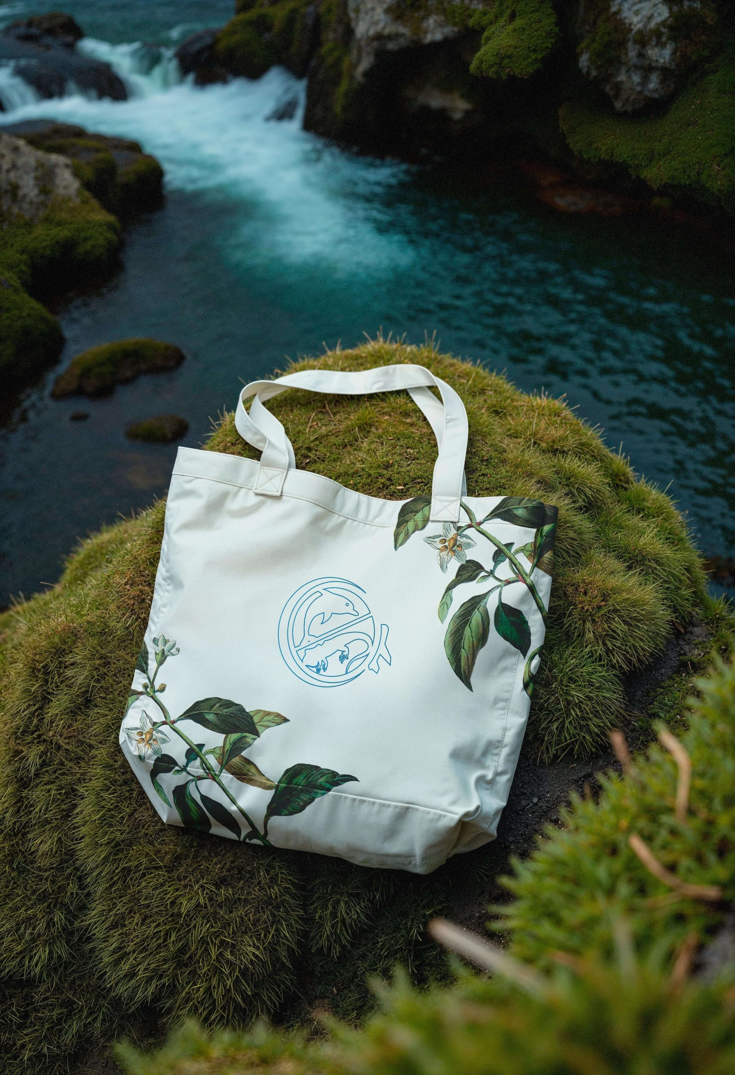
▪ Evidence
Following the relaunch, Galand Tour was able to better connect with its target audience and respond to changes in consumer behaviour after the pandemic.
This is evidenced by 18% digital interaction; moreover, booking requests grew by 20% during the first three months.
Although these results were encouraging at first, the reserves remained stable, reaching 10% against the starting point, before the brand change and the audits carried out.
The focus on environmental education, which was always its great differentiator, never changed; it was only evidenced more clearly thanks to the new branding, which is the great responsible for these results.
THE ROUTE04.11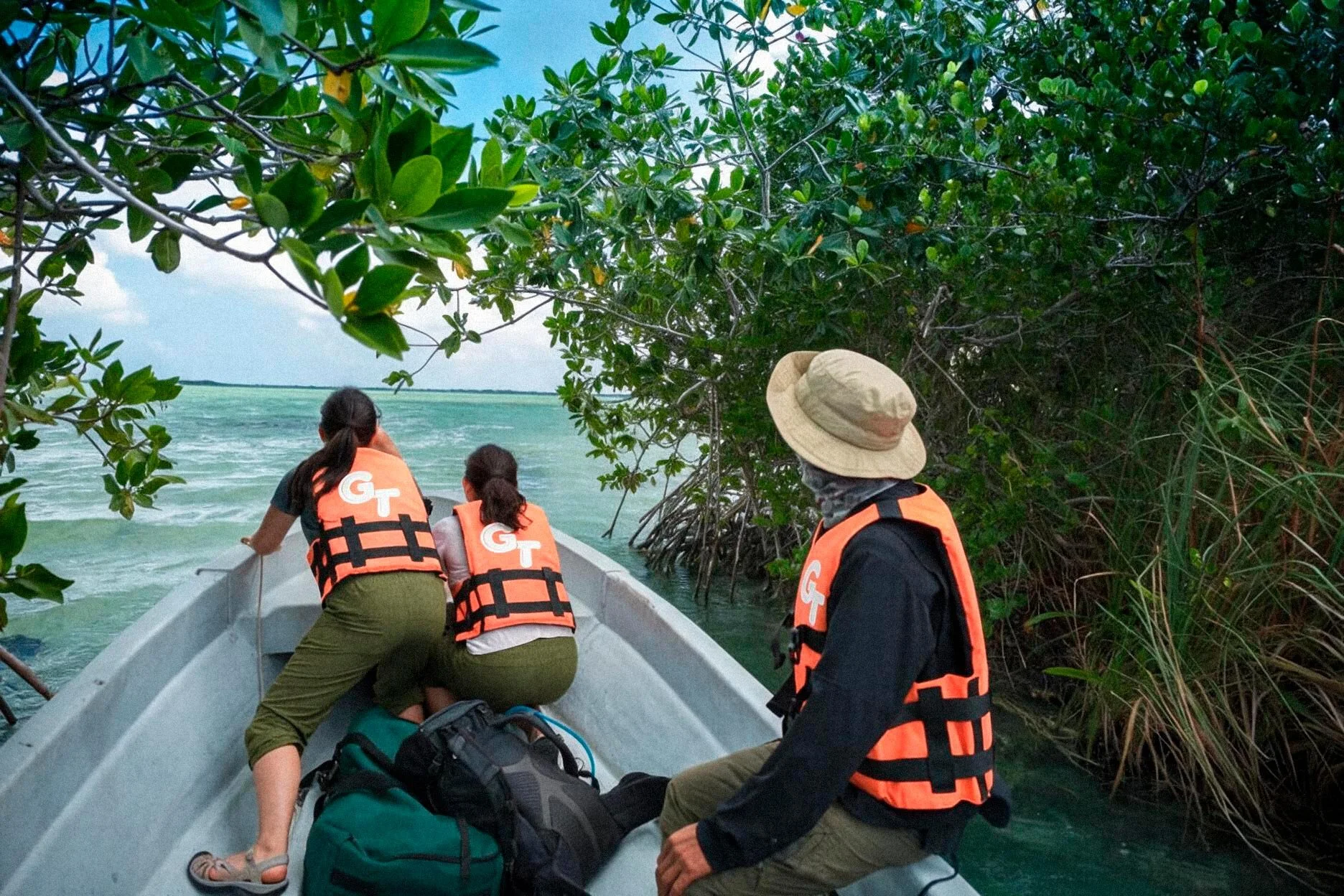
04.12(x) NARRATIVE THEMEThe Memory of the Earth is not explained — it is touched. Each texture is born from a different territory: the grain that mimics the Pacific coast, the impact ridges that lift the Sierra as if it were still moving, the raw earth that carries the weight of the Amazon and Galapagos. No excursion repeats itself. It turns what could be a simple map into something you remember with your hands as much as your eyes.
▪ Behind the Curtain
What we delivered, in the end, wasn't a new brand — it was a way for the land to tell its own story. Ecuador was already there, whole, waiting; our work was simply to let it be seen.