Mariuxi Carrera— Image, Style & Spa
ETHOS
More than a spa, it is a space for disconnection and revitalisation for women; this is how Mariú Carrera presents herself to her clients.
Mariuxi, as owner, decided that her philosophy of life would be reflected in her work; from there the sacred triad (sun, water and matter) was born, transforming body care into a ritual of personal reconnection. This vision is evident in the visual atmosphere that nature gives away, such as the reflections of light and the organic patterns that make physical space become a calm environment. Well-being cannot be treated as ephemeral, but rather as a lasting state in the body and mind.
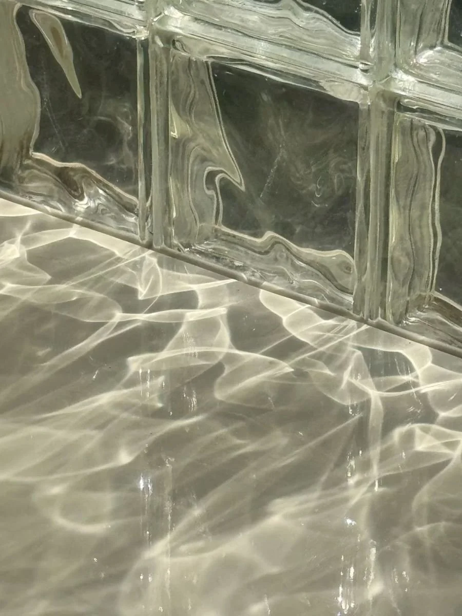
03.1(i) NATURAL CAUSTICS – OWN ARCHIVE – AY COLLECTION▪ Overview
Founded in Ecuador in 2017, Mariuxi started as any person who starts to undertake: with motivation, passion and determination. It was these three components that made it possible to sustain the spa for five consecutive years; as she went along, she herself realised that the business needed structure. He began to organise, but without a defined path, that organisation did not last more than two years; in the face of high competition, he faced a certainty: if order did not come, sooner or later the business would go to ruin.
This is where we started to restructure the business through the mentoring called MERAKI, where a business model was implemented that responded to reality and allowed it to grow within five years.
This implied making changes with the aim of being perceived differently, to be able to address a distinct customer, whose requirements were no longer basic, but emotional.
To this also added the change of identity: working in a branding that evidenced everything worked on mentoring. With the actions clearly defined, we start working on emotions and actions, going to the most basic: the Maslow pyramid. What came out of it was a characteristic visual atmosphere, inspired by the purity of light, water and matter, laying the foundation for something made to last.
▪ Evolution
Mentorship gave way to branding, focusing on the holistic, being the path most linked to the owner’s life philosophy. The brand strategy was based on emotions and actions such as sensitivity, transformation, union and growth, connected with a new way of presenting packages where price was no longer the first obstacle.
Linked to this, the sacred triad resulted in the refraction of light and natural caustics, initiating the creation of analog textures and becoming one of the reasons why guests would return to book at the spa.
In the end, verbal identity did its job, providing a soft and romantic narrative based on symptoms, setting aside technical jargon and diluting one of women’s great puzzles when they are already mothers. When will I have time for myself?"


03.2
NATURAL CAUSTICS – OWN ARCHIVE
Two years ago, while I was in the swimming pool of my friends' house, I took a set of photographs that are part of my own archive. In relation to this project, we discussed them and the owner acquired the rights to them through an exclusive and non-transferrable licence. The surface of the swimming pool has a natural texture that can be seen in the image; this is where creativity feeds on nature.
THE TRIAD OF ORIGINS
This is a photograph by Jo Stephen, taken in 2025. It served as my inspiration for creating the monogram, as I was looking for a flower whose petals, when in full bloom, would be pointed to represent the brand’s symbols: matter, sun and water; furthermore, a flower that is very common, whose natural habitat is in water, and which lives in it—and so I arrived at the lotus flower.
THE GRID AS THE MONOGRAM’S BASIC STRUCTURE
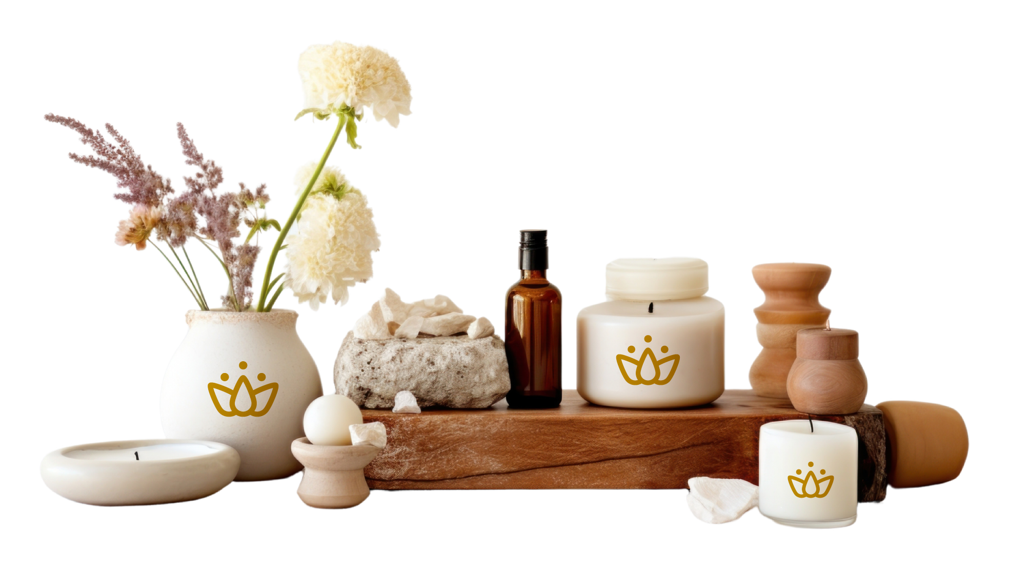
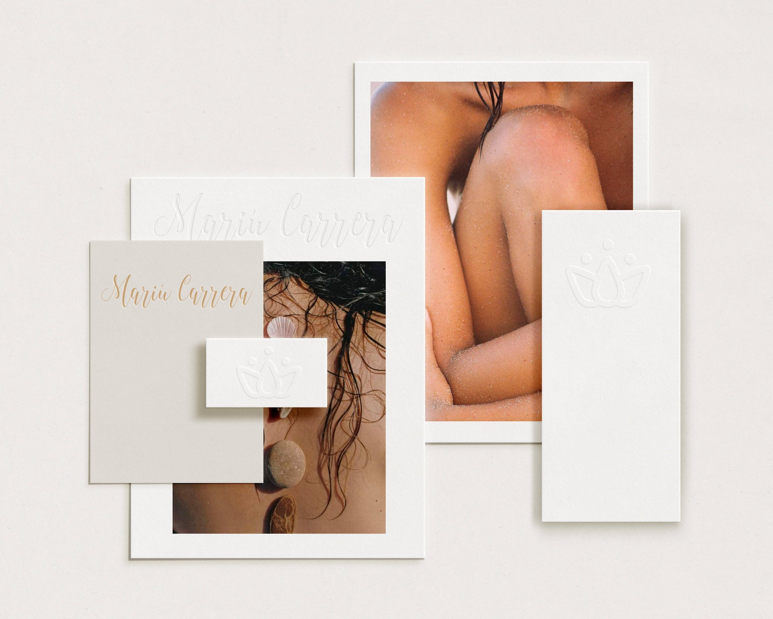
The monogram is derived from a stylised three-petalled lotus flower crowned by three circles — The grid not only provides aesthetic harmony, but also offers scalability — the monogram can be reduced to the size of a favicon or enlarged to a mural without losing its original proportions — and, above all, a rational basis that demonstrates that the symbol was conceived using objective criteria rather than merely intuitive ones.
MONOGRAM IN HIGH RELIEF
The monogram, which has already featured on one of the brand’s merchandise items, is used here as an embroidered emblem on the spa towels. Furthermore, its versatility and compatibility with the brand’s colour scheme are highlighted.
EDITORIAL STORYTELLING
This piece explores beauty as an emotional state rather than an aesthetic quality. The narrative is built upon vulnerability, stillness and a connection with the inner world, evoking a femininity that does not need to assert itself to be perceived. The editorial approach seeks to evoke a sense of reverie and belonging, inviting the viewer to inhabit an atmosphere where delicacy becomes identity and emotion becomes memory.
ANALOGUE PROCESS
A texture was created on acetate paper using the secondary colours from the colour palette. The technique involved dyeing sprayed water with ink in the selected shades, applying it to the acetate and freezing it so that the ice crystals formed characteristic streaks, bubbles and irregular patches. By photographing each sheet with raking light, the relief and depth of the crystallisation were captured. This texture has been incorporated into the brand’s collateral, used primarily in the design of gift cards and as gift wrapping paper, providing a handcrafted finish and a visual identity consistent with the brand’s sensory universe.By transforming corporate collateral into tactile, frozen art, we elevated the perceived value of gift vouchers, turning regular transactions into highly covetable luxury purchases.

[2] Behind the scenes during the creation of the analogue process: dyed water, sprayed with ink in the selected tones, applied to acetate and frozen, so the ice crystals would form the characteristic stripes, bubbles and irregular patches.

[1] This is one of the photographs that belong to the group of photos that the owner of the brand acquired. Here you can see from another perspective the whole environment.

03.8(viii) BRAND ARCHETYPE- THE MAGIC We worked with this archetype of brand because one of its qualities is to give pleasure and enjoyment that life gives, which harmonises perfectly with the visual atmosphere and narrative theme. We chose to focus on exclusivity and personalisation, rather than offering standard treatments, following a slow but lasting path.
Since each body is unique, the skin, one of the most important organs, requires special attention. Thus, there are no established packages without really knowing the need of the new target audience that are mothers; they are those same elements that will drive the new perception of the brand.
(ix) INSIGHTS—Nearby
—Enjoyment
—Disconnection
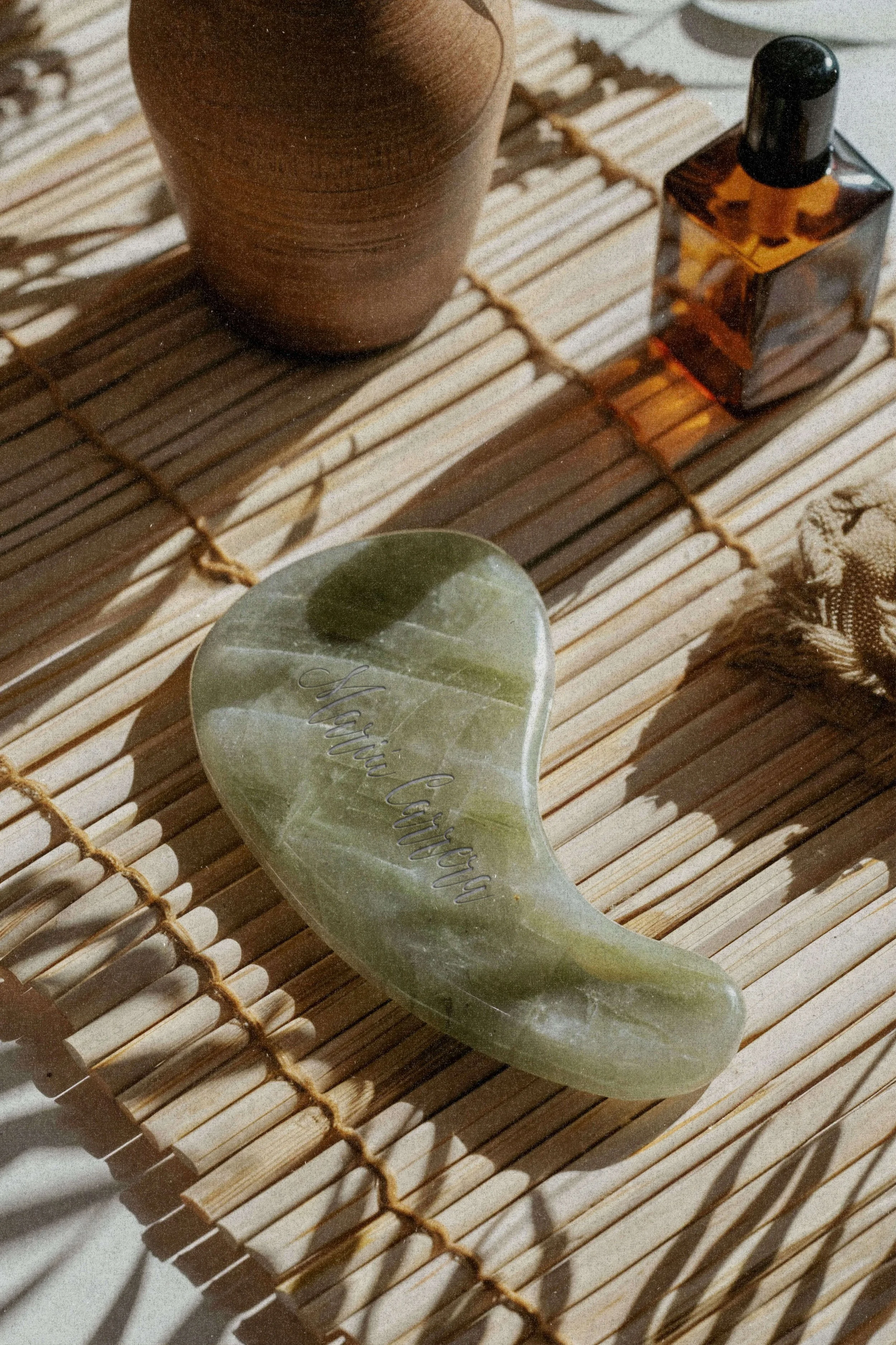
TOOLS OF CARE03.9THE APOTHECARY03.10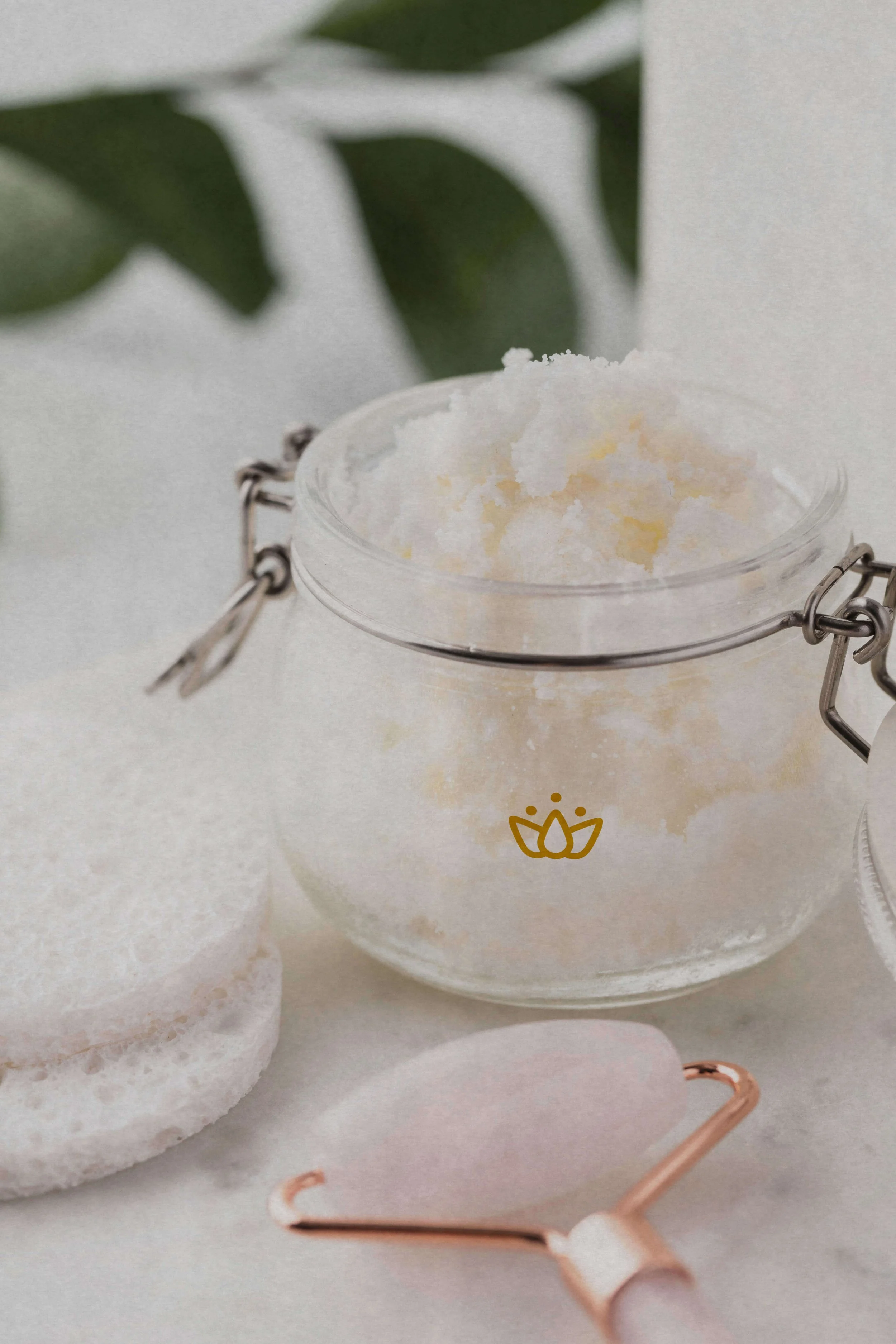
▪ Evidence
When the work is done based on a strategy and following a business model, the figures speak for themselves. The new public began booking, while its old public returned, increasing 15% in bookings.
The introduction of the online reservation system, which was easy and simple, eliminated the friction.
In addition, the choice thought about the symptoms of the customer made all the sensations are reflected in the environment, in how the brand is in its industry.
This is no accident; it is pure cause and effect. When such a change is made, this is where the theory is validated in practice—where consumer behaviour is palpated from perception to being reflected in sales. ! ! !
FRAGMENTS03.11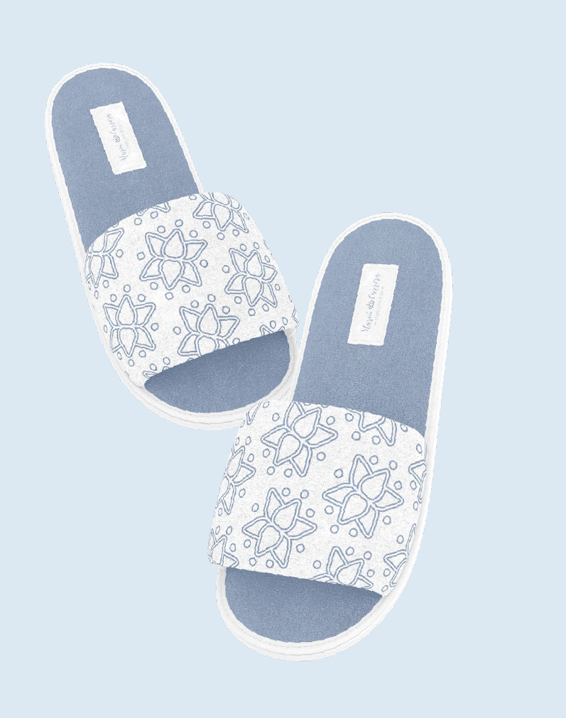
03.12(x) NARRATIVE THEMEThe “Trilogy of Being” is the central theme of the brand. A mystical narrative that springs directly from its visual atmosphere to honour the connection between water, sun and matter. The model slipper is not simply a utilitarian accessory; it is the physical embodiment and the starting point of this narrative.
The woman experiences the ritual of getting rid of the burdens of the outside world to land in the here and now.
▪ Behind the Curtain
What we delivered, in the end, isn't measured in documents — it's felt in the way light falls on water, and in the calm that stays after. Getting there wasn't only a matter of design: it was Mariuxi herself choosing to see her business differently, before asking anyone else to.