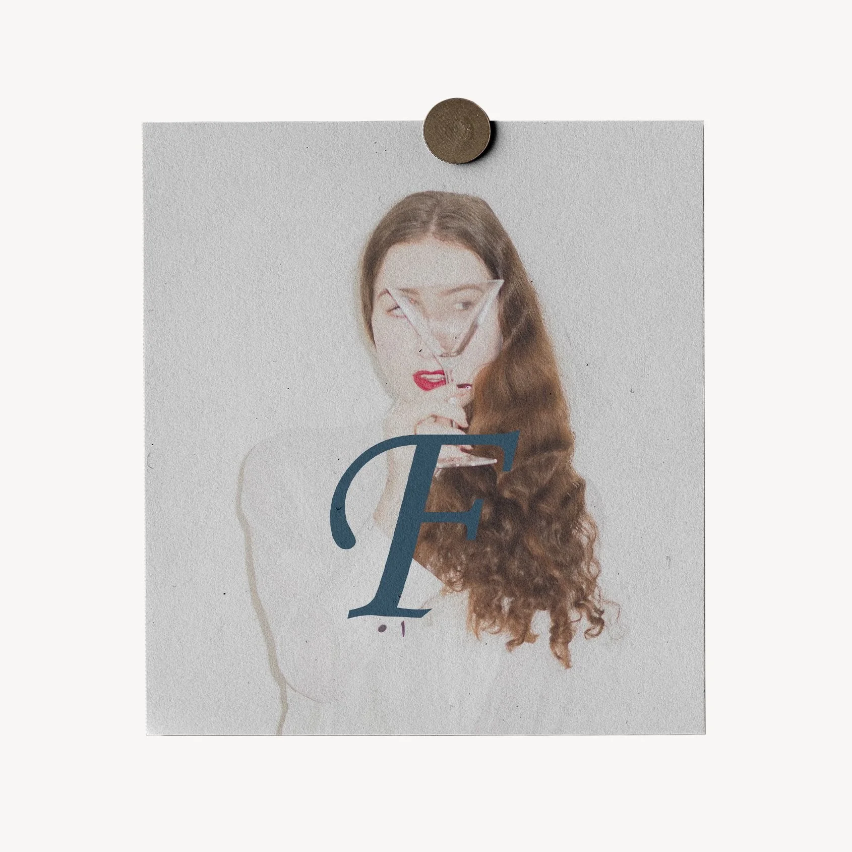
Fest Events — Luxury Wedding & Event Styling
ETHOS
Fest Events occupies the threshold where space becomes memory and light becomes visual poetry. Inspired by the intimate opulence and chromatic mystery of the grand salons of the late 19th century, we craft atmospheres that seek not merely to decorate, but to move. We hold a profound reverence for the solemnity, detail and texture of time, transforming the contemporary celebration into a living, theatrical and timeless tableau. We do not chase trends; we preserve sophistication in its purest, most mature and unforgettable form.
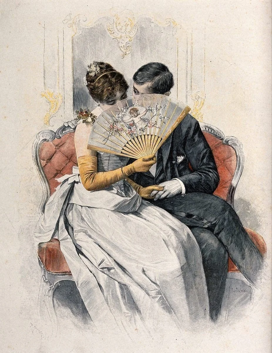
02.1(i) A COLOURED ILLUSTRATION ENTITLED ‘AT THE BALL’ BY ALFRED EDWARD EMSLIE,1889.▪ Overview
Founded in 2015, Fest Events built its name in Ecuador's children's events sector. The clamour found in birthday celebrations and occasions built around a child's day marked its early years, until the move into weddings came naturally, drawn in by couples who'd already seen the brand's work.
For its owners, that step led them into different territory, and with it came something harder to shake off: an identity built for balloons and party favours, now standing in front of couples planning something entirely different.
What surfaced first were three threads pulling in opposite directions: a visual and verbal language that shifted from one place to the next, nothing that set the brand apart from anyone else in the wedding sector,
and a story that never quite matched what an engaged couple truly pictured.[1]
Years anchored to birthday bookings had shaped the structure itself: quick, impulsive decisions, not the unhurried planning a luxury wedding demands. The depth of the problem lay in the visuals: a couple planning one of the most important events of their lives kept living in the shadow of a brand born in a market that had given it its early strength, but which had since moved on.
That inconsistency was costing the brand its own memorability — easy to lose among a dozen other options scrolled past in a single evening on social media. Fest Events needed an identity as considered as the weddings it was beginning to plan.

[1] The children's market kept the cash flowing. It just wasn't the client we needed to be reaching.
▪ Evolution
The shift into Fest Events went beyond a simple name change — it became a considered reworking of both strategy and aesthetics, guided by The Ruler archetype. Inspired by the chromatic atmosphere and intimate opulence of Alfred Edward Emslie's lithograph (1889), the new identity balances exclusivity with approachability.
That world is reflected in a refined logo with elegant typography, where the elongated 'F' and the fluid ligatures between characters symbolise the distinction and architectural luxury of the late 19th century.
On a verbal level, the tone that emerged was sophisticated, yet approachable, carrying the same attention to detail found throughout the identity. The change was anchored in authentic storytelling, with visual content built to feel assured, not performed.
We also restructured the business model itself, creating room for new service lines without diluting what the brand already stood for.[2]


THE GENESIS ASSET
Visual record of the brand's first large-scale production, a Guayaquil couple's wedding held in Quito, prior to the official rebranding. This project was, for its owners, the right moment for the change, because they accepted the budget exactly as presented, without negotiating a single cent. In honour of this work, the founder requested the incorporation of Indigo as the signature colour; a deep shade that genuinely permeated the luminous atmosphere of this first wedding and converged perfectly with the palette and mysticism of Alfred Edward Emslie's aristocratic illustration 'At the Ball' (1889). This service engagement, therefore, proved that the idea could stand on its own.
PENCIL SKETCH OF THE FEST EVENTS MONOGRAM
This pencil sketch presents an intertwined "F" monogram, drawn with elegant, sweeping lines that echo the refined social atmosphere of Alfred Edward Emslie's 1889 illustration 'At the Ball' The flowing calligraphic strokes suggest movement and rhythm, like a waltz crystallised into letterforms. The gentle pencil shading adds depth and intimacy, mirroring the soft, dimly lit ambience of a grand ballroom where silhouettes glide beneath chandeliers.
SQUARE VARIATION OF THE LOGO
The Fest Events logo in its square variation presents a vertical composition centred on a light beige background. "Fest" appears in a script typeface with a thick stroke as the visual anchor, while "Events." uses the same typeface but with a finer, lighter stroke, slightly indented. This difference in stroke weight is intentional: "Fest" is reinforced as the distinctive name, while "Events" is visually subordinated to create a descending rhythm, prevent a heavy appearance and evoke the contrast of nib calligraphy. "Decoraciones & Eventos" closes the composition in a small sans-serif — the point where an initial creative exploration became a formally registered trademark, now legally its own.
DECORATIVE PATTERN
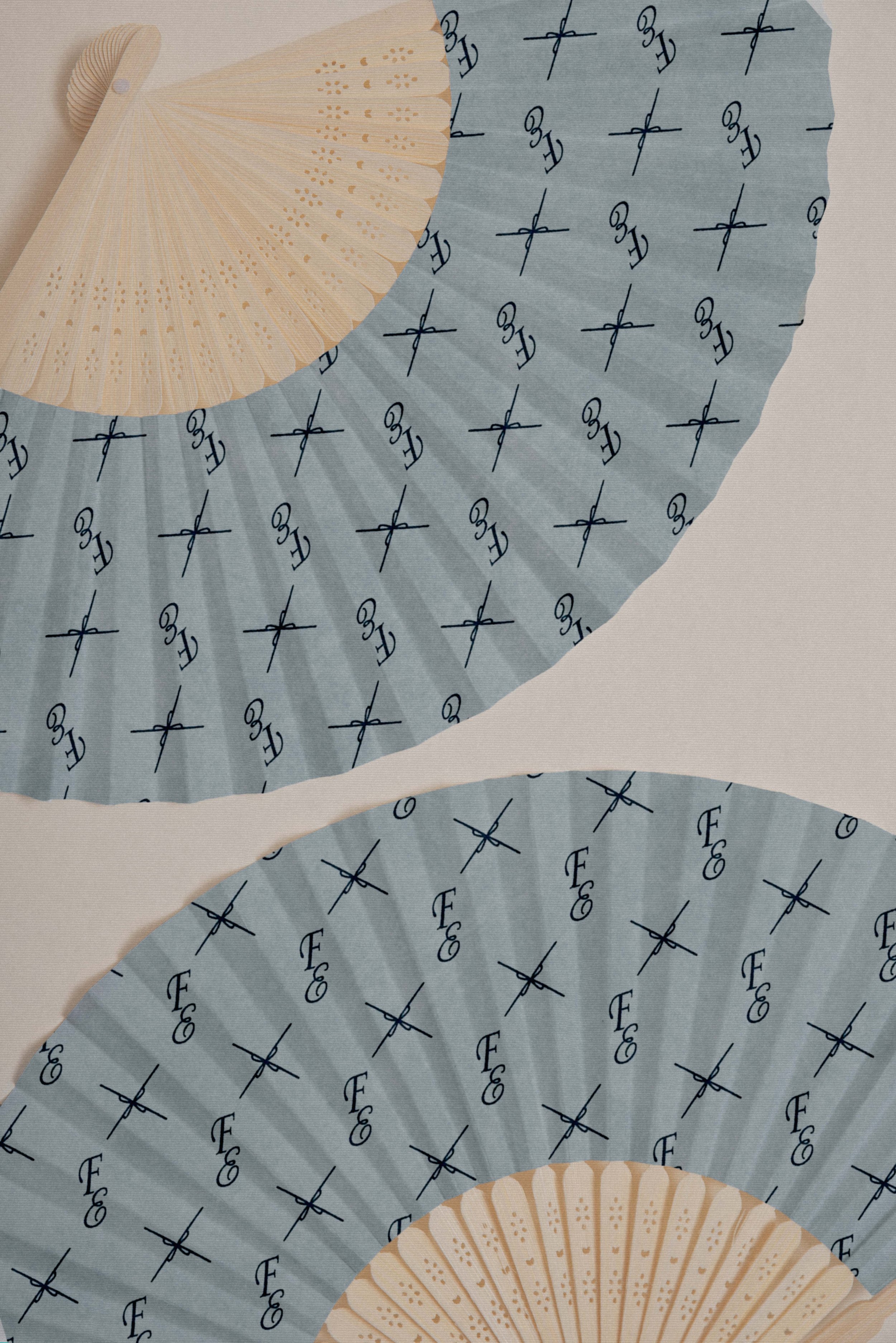
This decorative pattern is born from the fusion of the letters F and E from the Fest Events logo, intertwined in an elegant cursive monogram. The graphic element that accompanies the logo repeats in four directions, forming a Victorian X with clean lines that evoke interlocking motifs. Both elements — the monogram and the ornamental cross — alternate in uniform rows over a light blue background with subtle texture, creating a rhythmic repetition that conveys sophistication, order and a timeless classic feel.
PHOTOGRAPHIC DIRECTION
This piece is grounded in a pictorial reinterpretation of Illustration by Alfred Edward Emslie of chiaroscuro, transforming conventional black and white into a chromatic ecosystem governed by Indigo Tint. The densest shadows, the background, and the groom's suit will be saturated with this deep blue, whilst the high lights of the veil and the faces maintain a cold, ethereal luminosity. Finally, a subtle layer of analogue grain and a paper micro-texture will be added to soften the shot's digital sharpness, turning the movement of the veil into a living painting where the bouquet stands out as the sole point of luminous contrast amidst the gloom.
ANALOGUE PROCESS
A texture applied to the stationery, created using the analogue 'wet-on-wet' technique. By saturating cotton paper with water and applying pure indigo dye pigment, natural capillary action created an organic haze impossible to replicate digitally. This intentional unpredictability ensures that no two invitations are identical — turning something as routine as an invitation into a genuinely unrepeatable piece.

[2]Kept "Fest" as a nod to where it started. Added "Events" so it wouldn't stay boxed into weddings — galas, anniversaries, corporate celebrations, all fair game now.
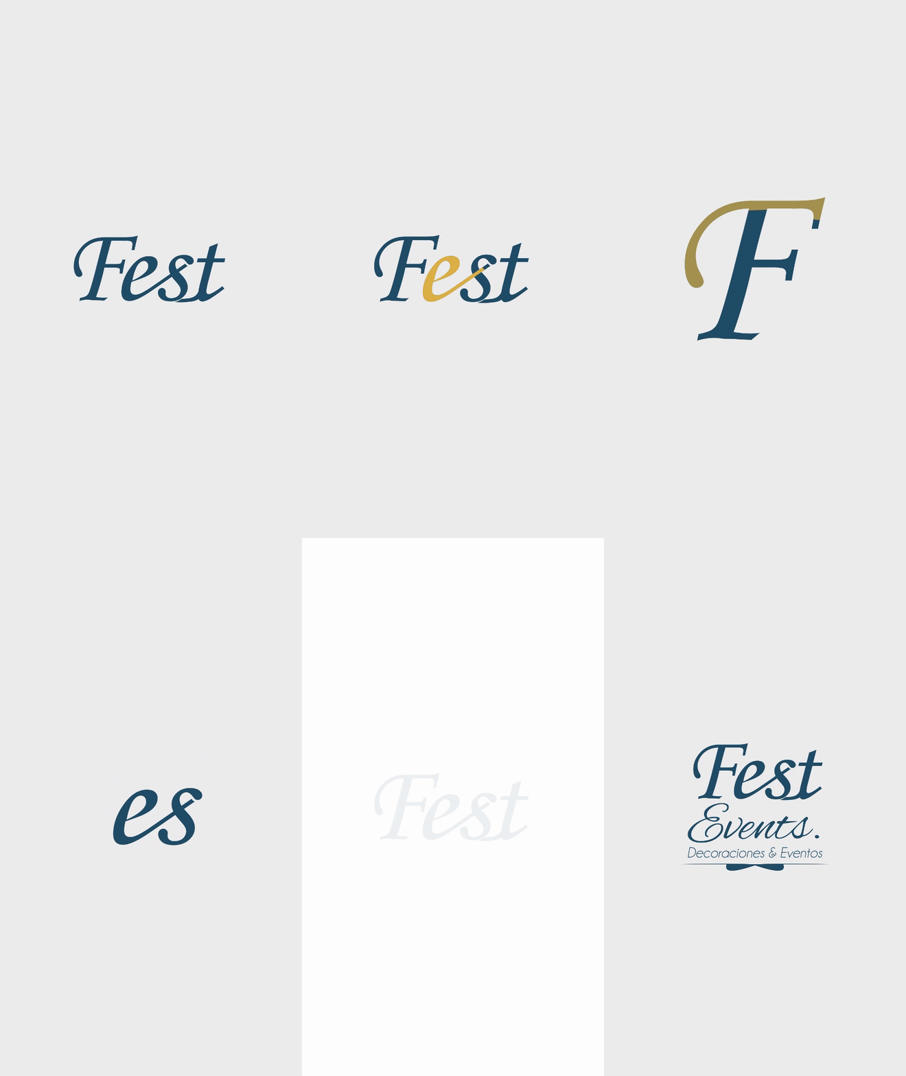
02.8(viii) THE RULER ARCHETYPEGuided by The Ruler archetype, everything in the design followed from one idea: an elegant, delicate, distinctive brand — sophistication that never had to announce itself, only show up in the details. In the design, we used a typeface with less influence from calligraphy, modifying the letter F and the vowel e. With the letter F, we extended the lobe to the left, ending with a glyph. And with the vowel e, we extended the hook to connect with the s.
(ix) INSIGHTS — Elegant
— Dreamer
— Distinctive
MERCHANDISING02.9KEEPSAKES02.10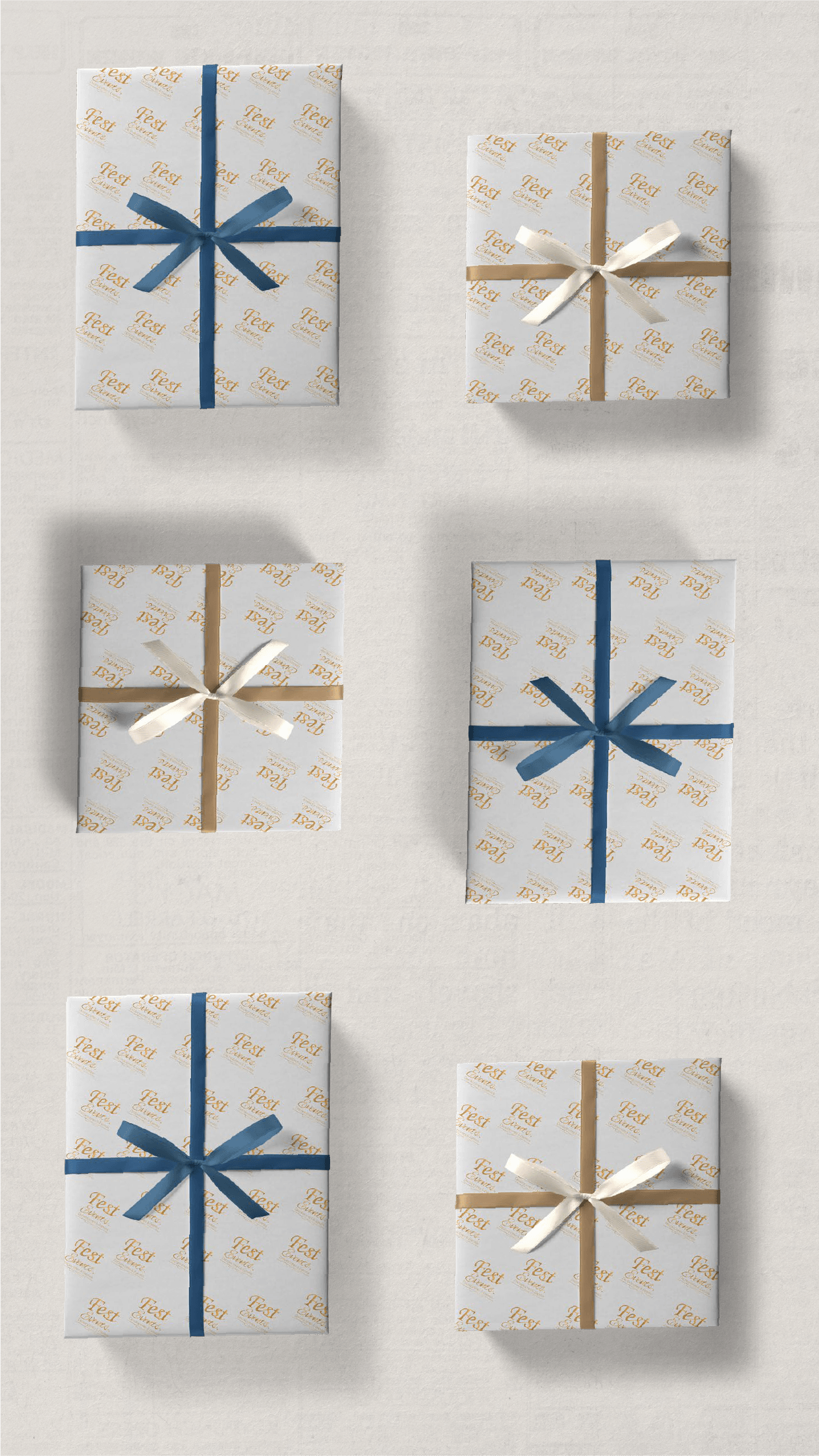
▪ Evidence

[3] For luxury packaging, colour takes a back seat. The real impact is in the touch: the centred logo in high relief on the light background invites you to feel it before opening the box.
What followed was not just a change in how customers viewed the brand[3]— six months into the launch, wedding planning inquiries and bookings went up an estimated 20% and didn't magically arrive.
Word of mouth began to move by itself. One wedding led to the next, referred to after referred to, and that same silent trust was built online without needing to push it, without negotiating any pennies.
The whole visual, verbal, sensory, strategy and analysis helped convince couples who previously only saw the wedding as an expense; this is where the most notorious result is given thanks to the implementation of branding; being aware that it was an investment in a crucial event of their existence, couples stopped perceiving it as an expense.
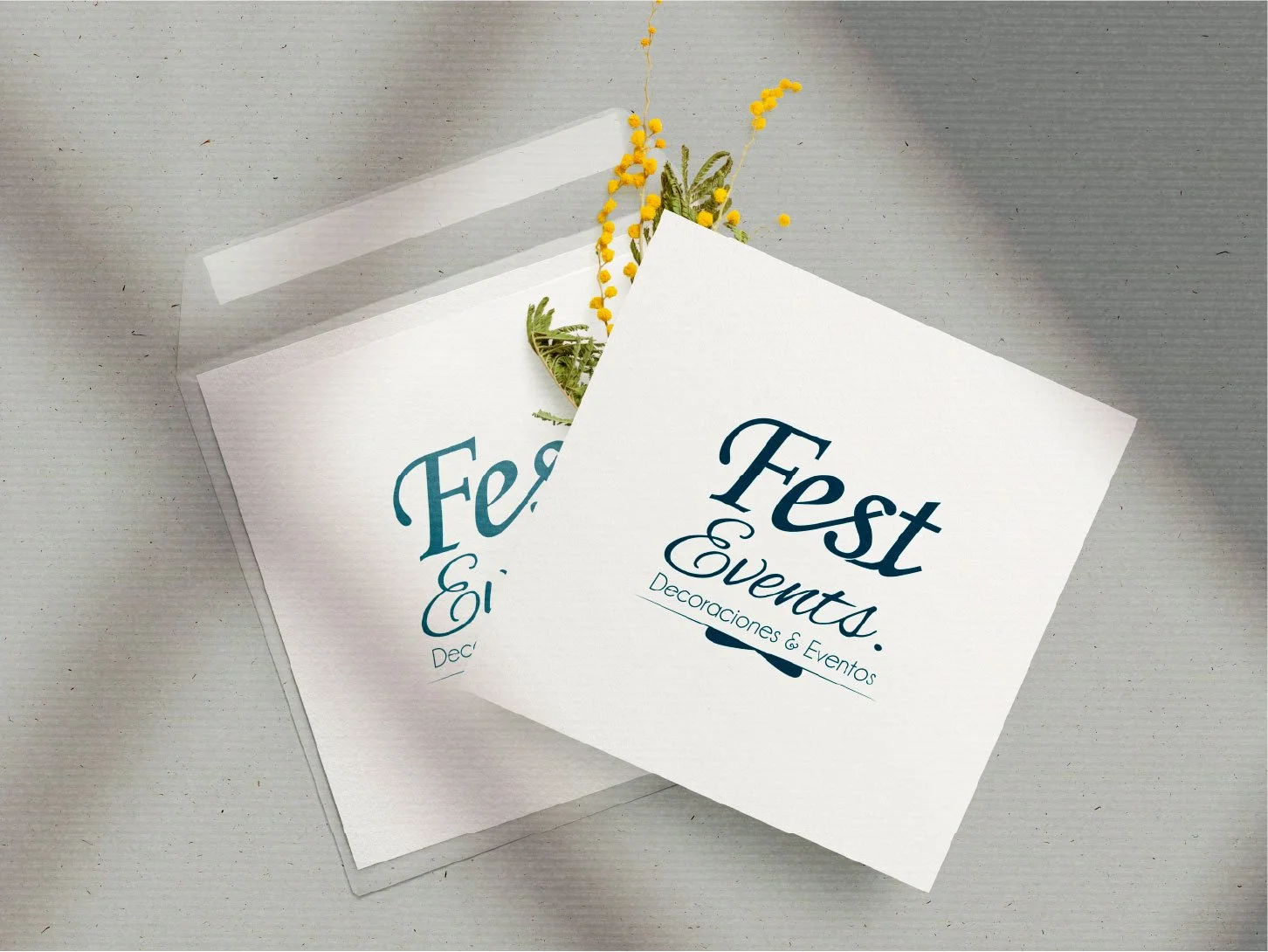
ENCLOSURE02.11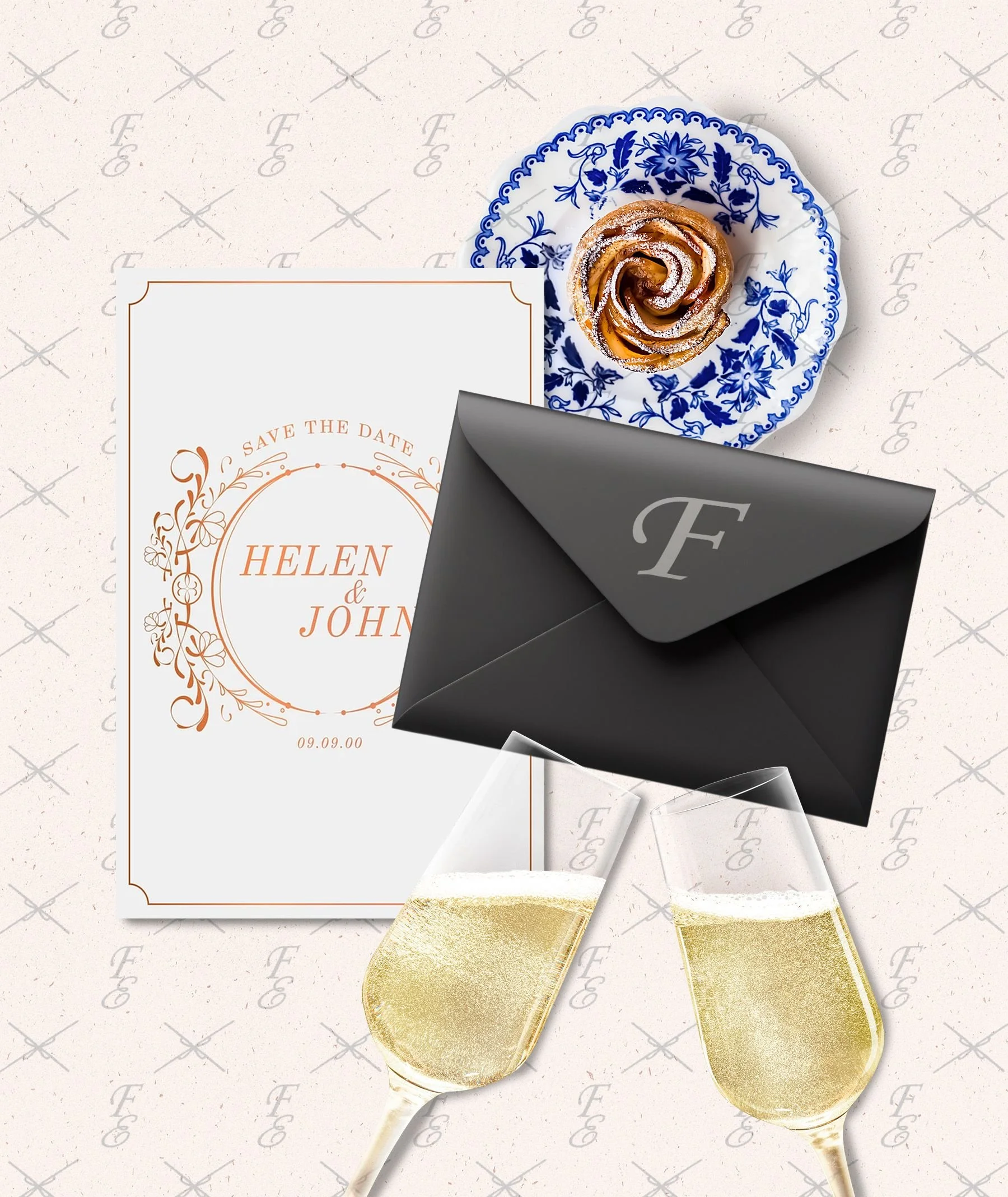
02.12(x) NARRATIVE THEMEInspired by the narrative of “AT THE BALL”, the welcome box became an extension of what the brand makes its customers feel. Each element seeks to generate a mixture of emotions and feelings typical of living the beginning of wedding planning; on the other hand, it also becomes one of the memories that the couple will have, making the brand endure.
▪ Behind the Curtain
A highly competitive brand, backed by the experience and growth of the owners, without fear of growing in an industry for which it was designed from its inception. And that is that, sometimes, the idea of entering directly into a market where the options are numerous is not in all cases the best option; Fest Events is an example of this.