Fucsia Store — Women’s Fashion & Lifestyle Store
ETHOS
An ode to timeless romance and the unspoken language of femininity. Just as 19th-century allegories personified the soul of nature, Fucsia Store manifests the collective spirit of three sisters bound by an innate devotion to style. This project is the structural preservation of a decade-long evolution—elevating a local fashion boutique into an architectural sanctuary for the contemporary woman.
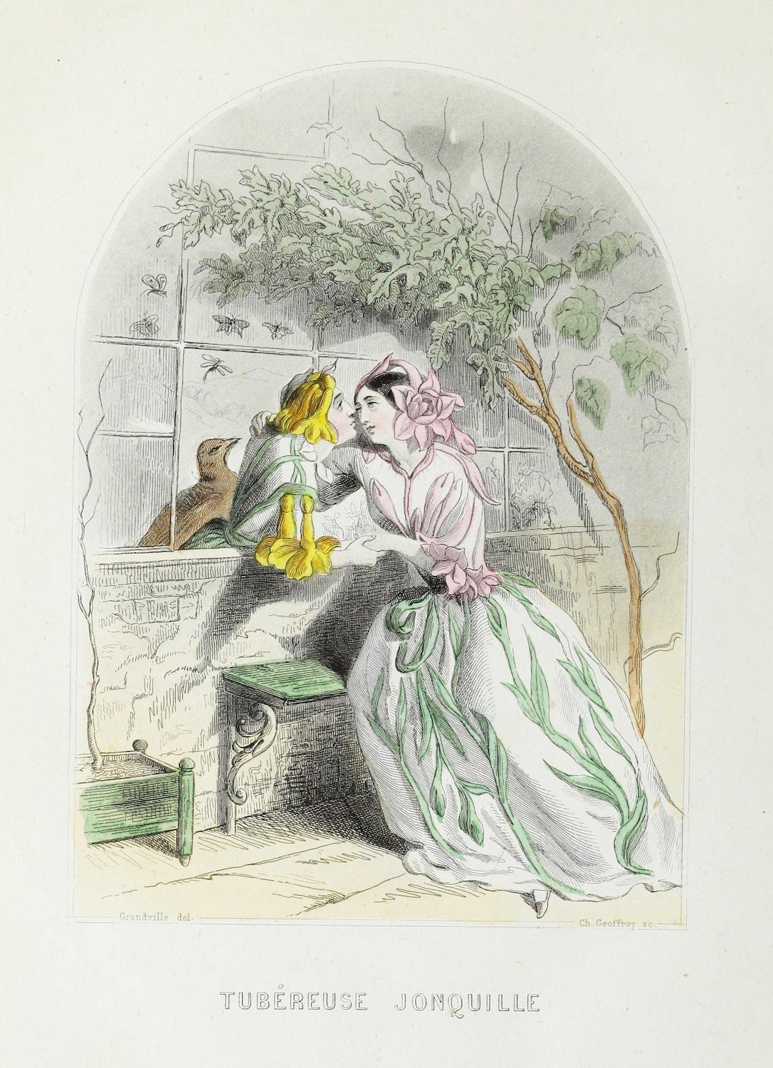
01.1(i) TUBÉREUSE ET JONQUILLE — SERIE LES FLEURS ANIMÉES DE GRANDVILLE, 1847▪ Overview
Set up in 2011 by three sisters, the boutique carried a decade of steady growth alongside a quiet mismatch: the identity never quite caught up with the business itself. Expansion came fast; recognition did not.
What surfaced first was a scattered visual presence — several logos over the years, and messaging that spoke past the customer it was courting rather than to her.
The rounded lettering and saturated palette carried, without meaning to, the register of childrenswear[1], often enough that visitors arrived expecting exactly that. For a brand built on a sharp, considered take on womenswear, that mismatch was quietly costing it ground it had already earned through the work itself.
By the time we came in, momentum alone could no longer carry the brand to where its product already stood.

[1] More than one visitor asked, at the door, whether the store carried children's sizes too.
▪ Evolution
The shift centred on the clients already devoted to the boutique — the loyal 70% who valued genuine connection and uncompromising quality above all else. That insight reshaped everything: tone of voice, sensory cues, visual language — all moving the brand toward what we came to call The Liberator.
We anchored that direction in Grandville's 1847 "Tubéreuse et Jonquille" (Les Fleurs animées)[2]— its whimsical botany and 19th-century romance gave us the exact atmosphere to build hand-crafted watercolour textures, deliberately apart from the generic, vector-driven language of fast fashion. What followed was a soft digital space, a poetic typographic voice, and a tailored pastel palette — the visual language of a boutique finally speaking with the same maturity as the product it had always made.


NATURAL SPLENDOUR OF THE FUCHSIA FLOWER
Close-up of pink petals in a spiral, with soft light and a faint green background. An organic dance between the ethereal and the natural.
WATERCOLOUR-STYLE FUCHSIA FLOWER
We worked with organic watercolours to recreate the fuchsia flower, preserving the natural fragility of its petals while maintaining a soft, historical cadence.
LABEL DESIGN
A label that communicates softness and nature; the floral embraces the textile, creating an identity that transcends the functional to become an emblem of the garment.
MONOGRAM IN HIGH RELIEF
The monogram doesn't sit flat on the card — it's pressed into high relief across a trio of tonal pieces: rose, red, pale pink, over a peach floral ground. Meant to be felt before it's read.
PHOTOGRAPHIC DIRECTION
The portrait doubles on itself — features softened under a layer of floral print, makeup left smudged, not perfected. The most sublime aspect of a woman is her blossoming, not her finish.
ANALOGUE PROCESS
I chose to work with cosmetic pigments, pressed in with the pads of my fingers, so my own fingerprints would interlace and — quite literally — form a texture of their own. In places, the blending was done with cotton. Digital post-production came after: selective desaturation and photographic grain, until the surfaces settled into diffuse gradients and textures with the irregularity of touch. No prompt writes with fingerprints.

[2] Taken mid-process, fingertip still working the paper, in the middle of the analogue development.

01.8(viii) BRAND ARCHETYPE- THE LIBERATORThis transformation lives in something quieter than a slogan — tailored pastel tones, a typographic cadence with room to breathe. Intimate, direct language meets the romantic heritage of the fuchsia flower, and what remains is a space built for the modern woman: raw, sophisticated, entirely her own.
(ix) INSIGHTS— Delicate
— Romantic
— Femininity
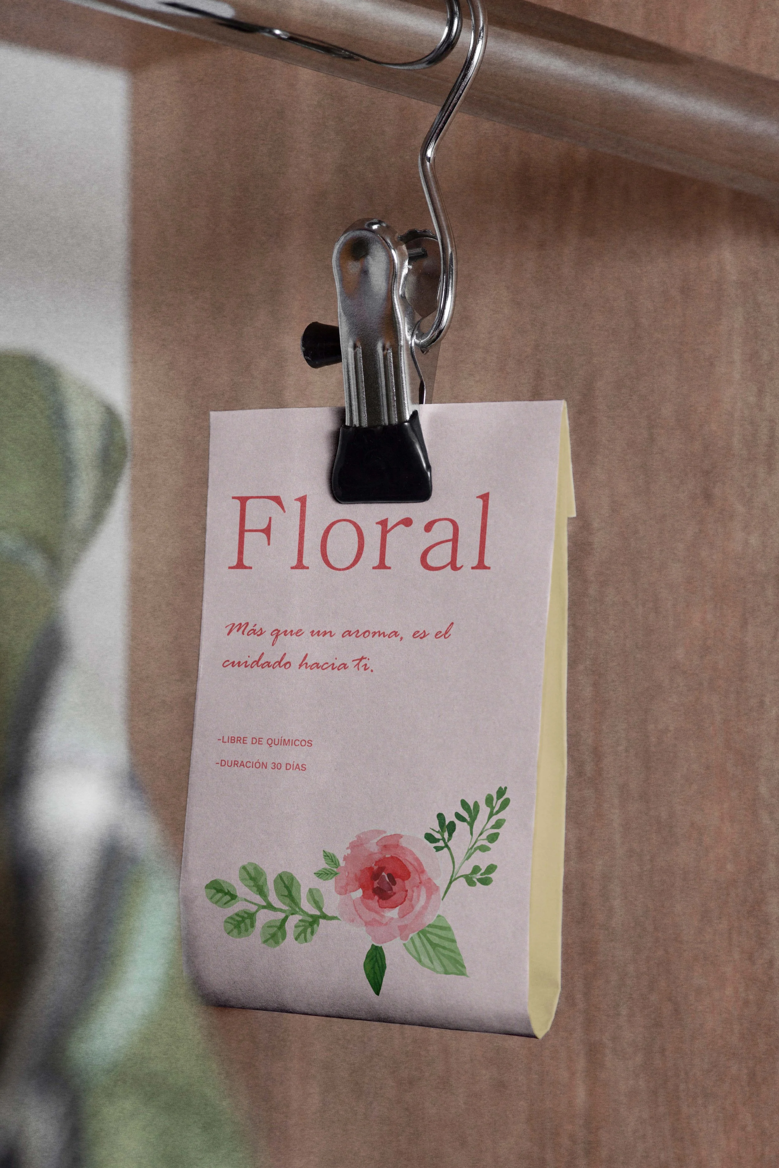
HANGING FRESHENER 01.9 NEWSPRINT PAPER01.10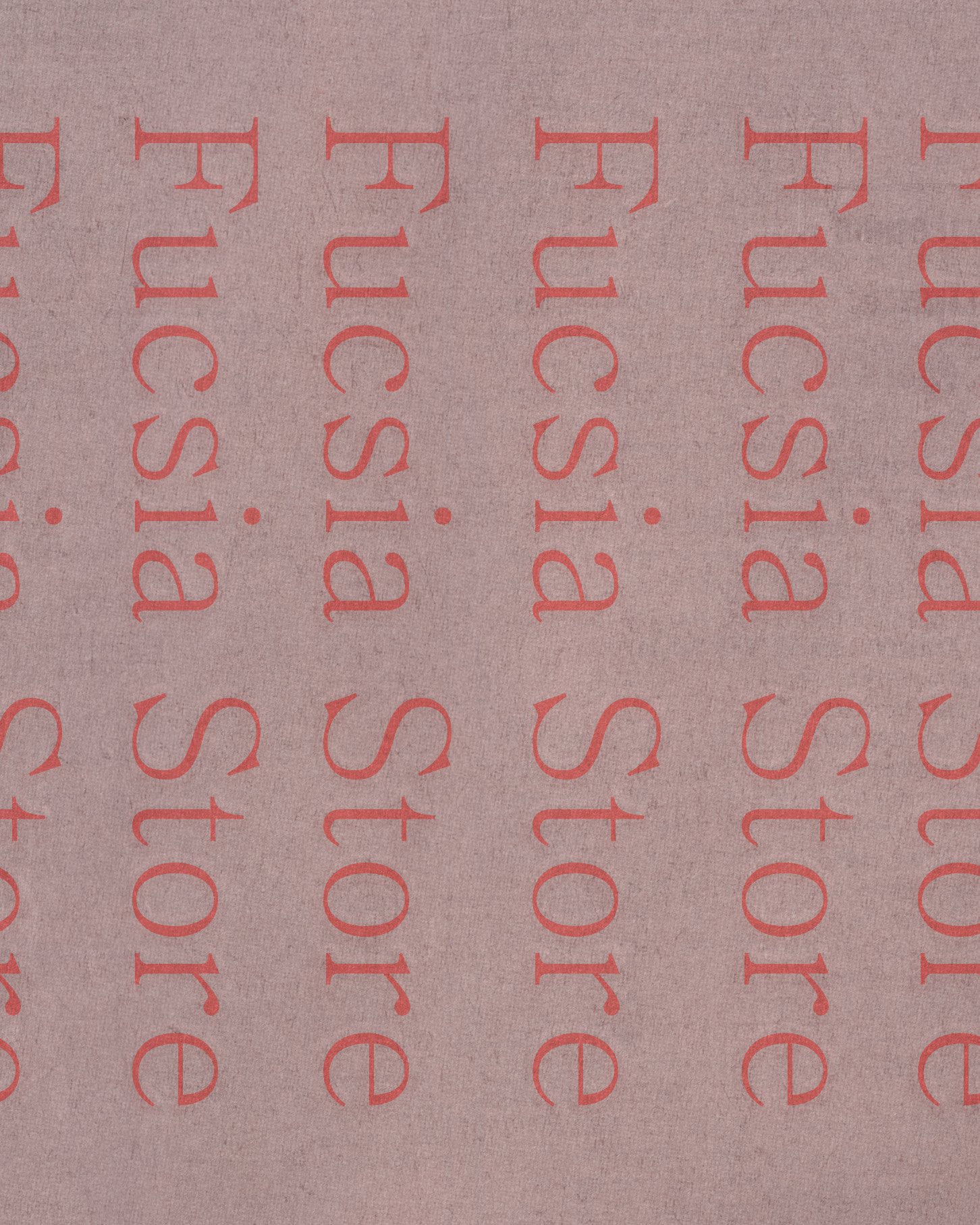
▪ Evidence
What followed wasn't measured only in numbers, though the numbers were there too[3]. Within months of launch, digital interaction rose by an estimated 3%, carried less by tactics than by a brand that finally sounded like itself — visual storytelling and a voice with more nuance than before, turning passive scrolling into something closer to a relationship.
Sales followed a similar curve, up an estimated 4%, once the childrenswear confusion was gone for good and the value of the product stood on its own.
The boutique began reaching a different kind of client — one who recognised, rather than had to be convinced of, what she was looking at.
Perhaps the quieter shift was internal: years of scattered logos gave way to a single, unified system. Rollouts that once stalled at every step could now run on their own, without a hand constantly steadying the brand's identity.

[3] Boxes and bags now share one visual identity — no more clutter, every parcel arriving as considered as the piece inside it.
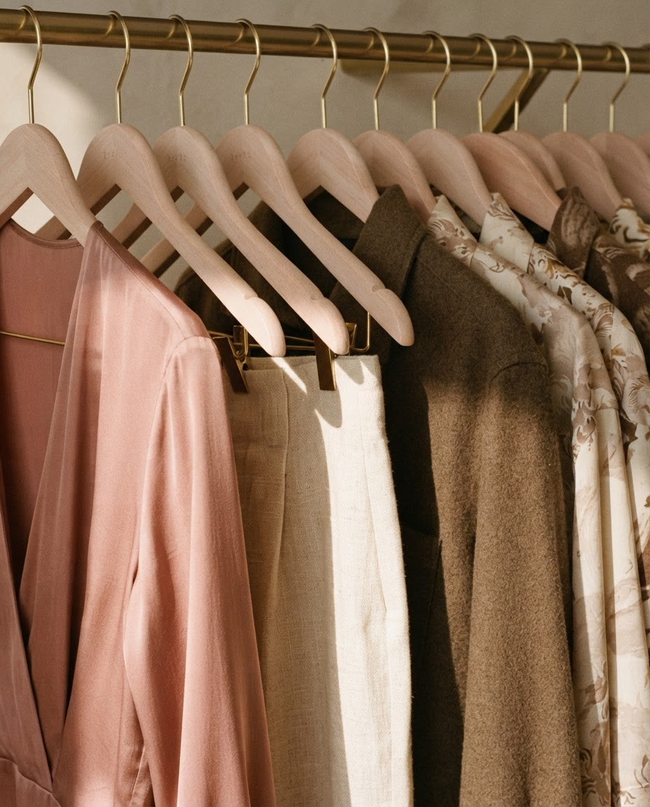
THE LINEN COLLECTION01.11The collection that followed — gone from the shelves within months.
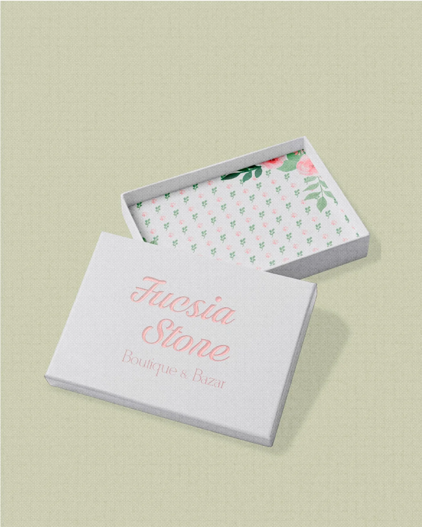
01.12(x) NARRATIVE THEMEThe box carries the same thread as everything before it — The Hour of Blooming, the moment The Liberator's quiet confidence becomes visible from the outside. The pattern wrapping it isn't decoration borrowed from elsewhere; it's the same botanical language built for the identity, closing the story the way it opened: with a flower learning to be seen.
▪ Behind the Curtain
What we delivered, in the end, is simpler to say than to list: a brand with a voice of its own — unmistakable, impossible to confuse with anything generic, carrying the same care in a box as it does on a hanger.