Vaness Store — Premium Fashion & Curated Boutique
ETHOS
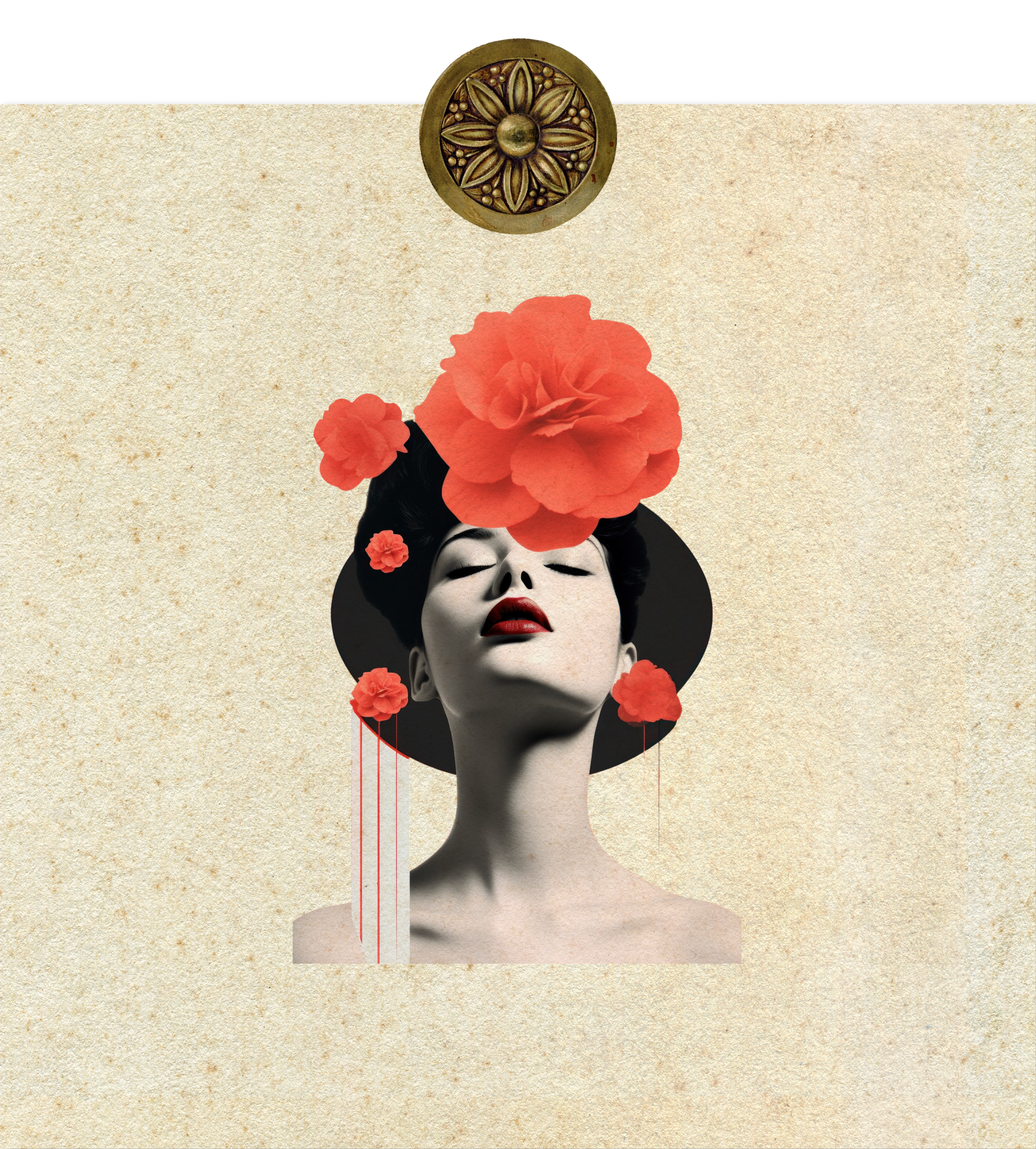
An ode to timeless romance and the unspoken language of femininity. Just as 19th-century allegories personified the soul of nature, Fucsia Store manifests the collective spirit of three sisters bound by an innate devotion to style. This project is the structural preservation of a decade-long evolution—elevating a local fashion boutique into an architectural sanctuary for the contemporary woman.

05.1(i) PORTRAIT OF MADAME GELY (ON THE COUCH). FREDERICK CARL FRIESEKE, 1907Vaness Store — Premium Fashion & Curated Boutique
(i) Tubéreuse et Jonquille — Serie Les Fleurs animées de Grandville, 1847
ETHOS
Vaness Store stands as an intimate sanctuary of contemporary style, where curation becomes an act of personal proclamation. The boutique’s philosophy redefines high-end retail as a space of private revelation. The Vaness woman is audacious without being excessive, playful without losing her innate elegance, and fully conscious that every garment, accessory, and silhouette she claims is a visual translation of her inner world. Here, fashion is stripped of fleeting trends, emerging instead as an enduring archive of individual identity and light-sculpted sophistication.
▪ The Canvas & Overview
Operating within the dynamic retail sector, Vaness Store functioned as an apparel boutique seeking to elevate its market presence and move away from generic positioning. Every market cycle operating without an integrated framework represented a subtle opportunity cost [1] affecting how efficiently the business could capture and retain high-value customer engagement in a crowded marketplace.
To construct a definitive market position and secure a sustainable structural foundation, we deployed a synchronized dual approach: the development of its Branding, executed in parallel with a tactical Deep-Dive Session designed specifically to streamline and align the sales management framework.
The Friction Point: The Deep-Dive analysis revealed that while the business possessed a clear vision of its target audience, this core essence was not visually expressed due to the lack of a centralized brand system to provide structure and consistency.
Furthermore, the need to refine key moments within the sales process created subtle disconnections in the buying experience, demonstrating that without a unified commercial framework and strategic visual order, the boutique's value proposition lost clarity and impact during critical customer interactions.

[1] Record note: This pixelated screenshot is the only visual record we could rescue of the boutique's original storefront before the redesign. Despite the low quality of the photo, it perfectly highlights the challenge: a window display with incredible garments, yet trapped under a completely blank and identity-less sign.
▪ The Insight & Evolution
Rather than allowing the business to lose time and financial capital through traditional trial-and-error marketing, Deep-Dive Session acted as a commercial accelerator. By mapping and refining the conversational funnel, the response led to the formulation of the "Sade Attitude" creative concept, systematically synchronized with Brand Archetype — The Radical and driven by the narrative theme "The Unattainable Cherry". This analytical decision established a powerful, paradoxical allure: an intimate, sensual, and magnetic universe that provided immediate direction to what was previously unexpressed, transforming the act of buying into an elite experience of personal autonomy and sophisticated non-verbal power.
Through this strategic immersion, we injected absolute cohesion into the boutique's architecture. At an expressive level, a confident, warm, and subtly playful tone was introduced across all transactional touchpoints, ensuring that product descriptions and customer interactions reinforced female confidence.
At a sensory level, the visual universe was engineered to protect the brand's premium status through a luminous and intimate atmosphere. Through a conscious selection of materials, finishes, and structured presentations, every single interaction was designed to validate the customer's identity. This precise execution bypassed months of costly operational misalignment, saving the brand vital resources while constructing an exclusive, unified ecosystem.


PENCIL SKETCH MONOGRAM
Sometimes, the solution lies within the disposable. While the internal changes were already significant, its visual identity was based on the behaviour of its customers, who stops to read garment tags, not to check the price, but to suss out haute couture details and designer notes. Spotting that these valuable minutes of attention are the boutique's main touchpoint and the most remembered physical element of the brand, the tag became the structural reason behind the monogram.Based on the initials V and S, these were structured using an interlocking, airtight stroke. This geometric intertwining translates the brand's inherent tension: by unifying the lines in a compact and guarded way, it projects mystery and sophistication as an emblem of sophisticated, non-verbal power
HIGH-RELIEF NAME APPLIED TO THE COLOUR PALETTE
We decided to go with colours that resonate with everything we have built. These colours strongly emphasise the brand archetype. Together, they communicate accessible luxury with personality, which sends a powerful message that contrasts with all the internal sales work that was done during the mentoring process.
INTENTION IN LABEL DESIGN
We wanted to break away from the conventional in our clothing label design. We started with a pattern based solely on the brand name, but kept the front side minimal so as not to lose a sense of closeness with the customer. Everything was random — not all garments carried both labels. Instead, several models were designed with the intention of making them collectable, acting as a purchase commitment mechanism. At the end of each season, customers could exchange their labels for a garment of their choice. For the boutique, this was an enormous sales win. To heighten the exclusivity, each label was finally engraved with the name of the customer who bought it
BOX DESIGN
The box design transforms a functional package into a discovery experience that elevates the boutique's perceived value. The brick pattern references the authentic origin of the physical space, the emblem "The Unattainable Cherry" evokes desire and aspiration, and the rotated monogram inside conveys identity and order. Qualitatively, this translates into sensory differentiation, high brand recall, emotional connection to the store's real history, and a customer who does not merely buy a garment but experiences the brand in every layer — fostering loyalty and justifying a premium positioning.
AUDITORY SENSORY IDENTITY
Strategically, “Fashion Walker EDM For Chill” (House Luxury, 2022) serves as the auditory anchor of a 360° shopping experience; at the same time, its premium atmosphere immediately evokes the setting of haute couture fashion shows, prompting customers to subconsciously associate the products with luxury, design and good taste, whilst its contemporary balance resonates directly with the colour palette and textures of the physical packaging, transforming the act of shopping into a multi-sensory delight where exclusivity is not only seen and felt, but also resonates, influencing a conscious and aspirational purchasing decision.
ANALOGUE PROCESS
This design comes from a 100% analogue process, crafted by hand using cotton and pink shading, topped off with watercolour pencils to get that fluid, organic look. It was then digitised with a touch of subtle noise during post-production, ensuring an authentic result with absolutely no AI involved.For the business, this design works as a cracking high-value visual asset. It’ll be used on the tissue paper for wrapping delicate garments, turning the unboxing into a proper premium, multisensorial experience. The end result is a key feature that shores up Vaness Store’s delicacy, care and exclusivity at every single touchpoint

[3] Process note: My desk ended up covered in wood shavings and pink graphite dust after this sketching session. I decided not to clean the table right away so I could take this photo; I like remembering the manual mess behind a clean digital file.

[2] This is the rustic brick wall right behind the store's main counter. The box pattern was born directly from here. I thought it was a nice touch for the packaging to echo the actual texture of the boutique's building.

(viii) Brand Archetype — The Radical
The Radical archetype is the engine that unifies Vaness Store’s strategy. Far from traditional marketing, this disruptive profile breathes life into "Sade Attitude" and "The Unattainable Cherry" narrative, creating an intimate, sensual and magnetic universe. It doesn’t look to fit in; it breaks the rules with elegance, turning shopping into an act of autonomy and non-verbal power. This rebellion balances beautifully with the hermetic monogram and the delicate, analogue design.
(ix) INSIGHTS
— Identity
— Daring
— Esoteric
▪ Results: From Diagnostic to Performance
Once the key areas had been identified through the in-depth analysis session and the brand identity had been established, Vaness Store began to show clear, measurable changes, both commercially and in market positioning. These results demonstrate how well-targeted decisions can lead to tangible and sustainable business growth.
-
Following targeted adjustments in commercial management, the business recorded an estimated reduction of up to 10% in average sales closing time. This was achieved through clearer communication of each garment's value and a service structure significantly more focused on client experience.
-
By redefining product presentation and introducing curated, full-outfit styling suggestions, the average ticket increased by an estimated 10% to 12%, driving more strategic sales and optimizing profitability per customer without relying on massive traffic volume increases.
-
Driven by a clear identity aligned with its core essence, Vaness Store experienced an upward trajectory with an estimated growth of up to 10% in the rate of repeat customers, reflecting a more robust connection with its audience and securing a highly memorable brand experience.
(x) NARRATIVE THEME
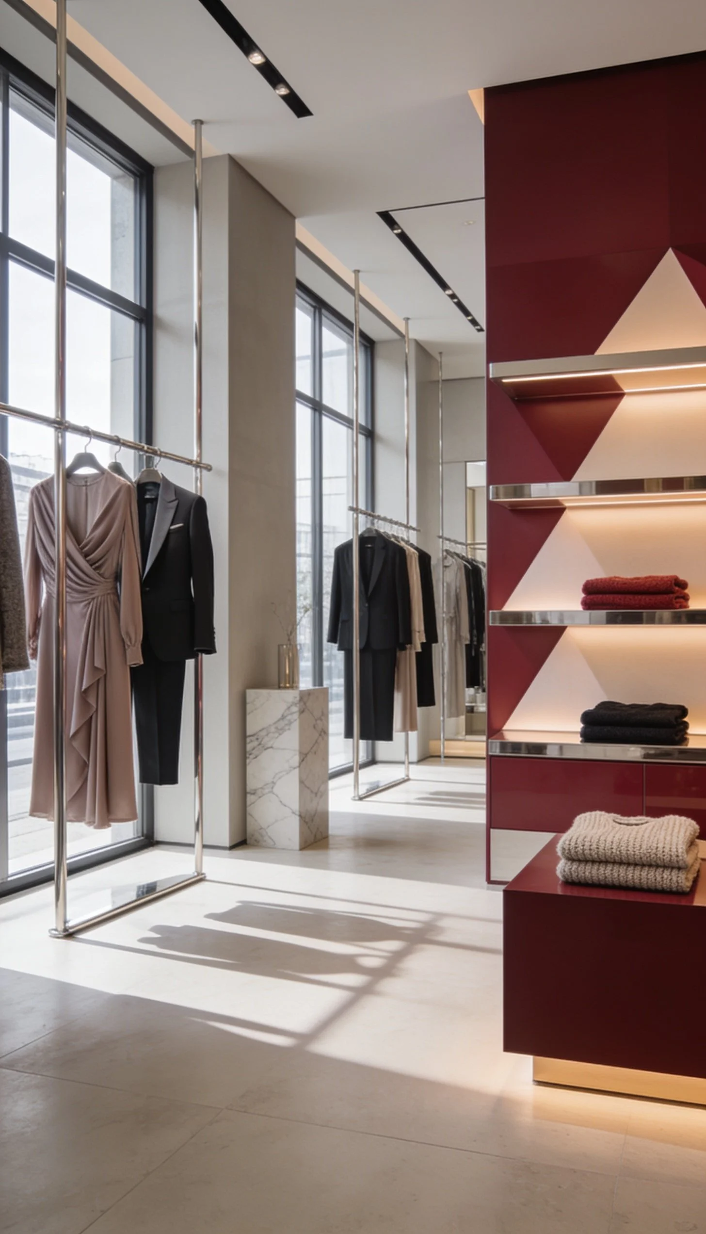
The forbidden fruit lives in the details. That cherry-red display doesn't just show off — it seduces. The sunlight pouring through the windows doesn't just light the space — it reveals what's close but never quite yours. Black silks, sharp tailoring, everything suspended in a room that breathes quiet luxury. Every corner of Vaness Store is built so you look, you want, and you accept that some beauties aren't meant to be touched — just admired. That's The Unattainable Cherry: luxury that's always one step ahead
▪ Behind the Curtain
The ultimate outcome is a fully matured and consolidated high-end brand, endowed with the commercial solidity and visual sophistication required to position itself immediately within prestigious shopping centres and compete with authority in the ultra-luxury market. We deliver a high-value business asset, strategically structured for national expansion and the opening of new branches without diluting its identity.